
To get this out of the way: I find it still a little cruel when the Carolina Hurricanes and Colorado Avalanche celebrate their respective descents from the Hartford Whalers and Quebec Nordiques. Yes, it's been 30 years, but as long as fans of relocated teams are still alive, turning around and milking that nostalgia for jersey sales will always feel a bit like dunking on people who got screwed over by their owners and the league, and rubbing it in that they no longer have an NHL franchise. Everyone understands this is a business, but part of that business plan involves pretending there's something special, too—a real bond between team and city—and that rings all the hollower when the team says, Hey, remember when we ditched your asses?
All that said, Canes-Avs on Thursday, both in their throwback sweaters, was the most gorgeous-looking uniform matchup we're going to see all season.
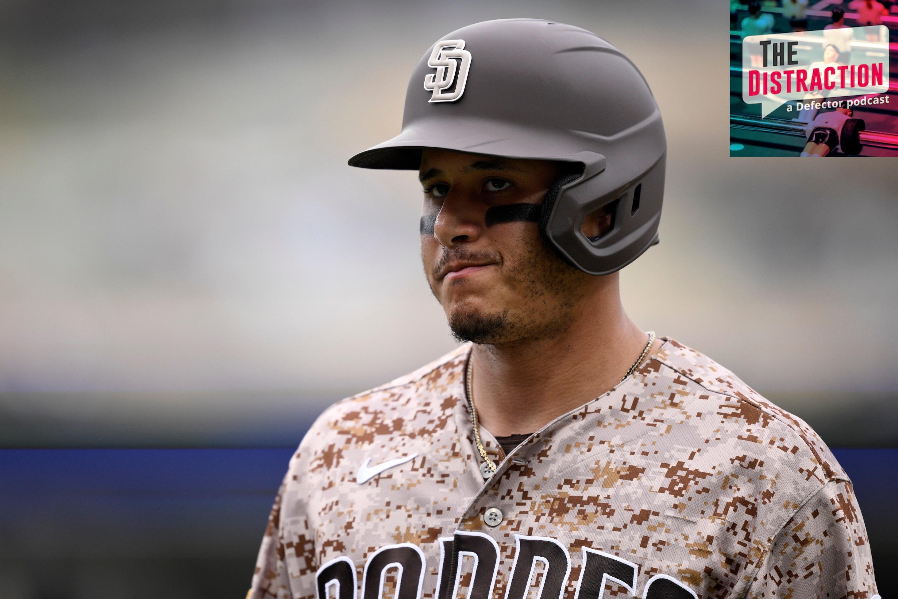
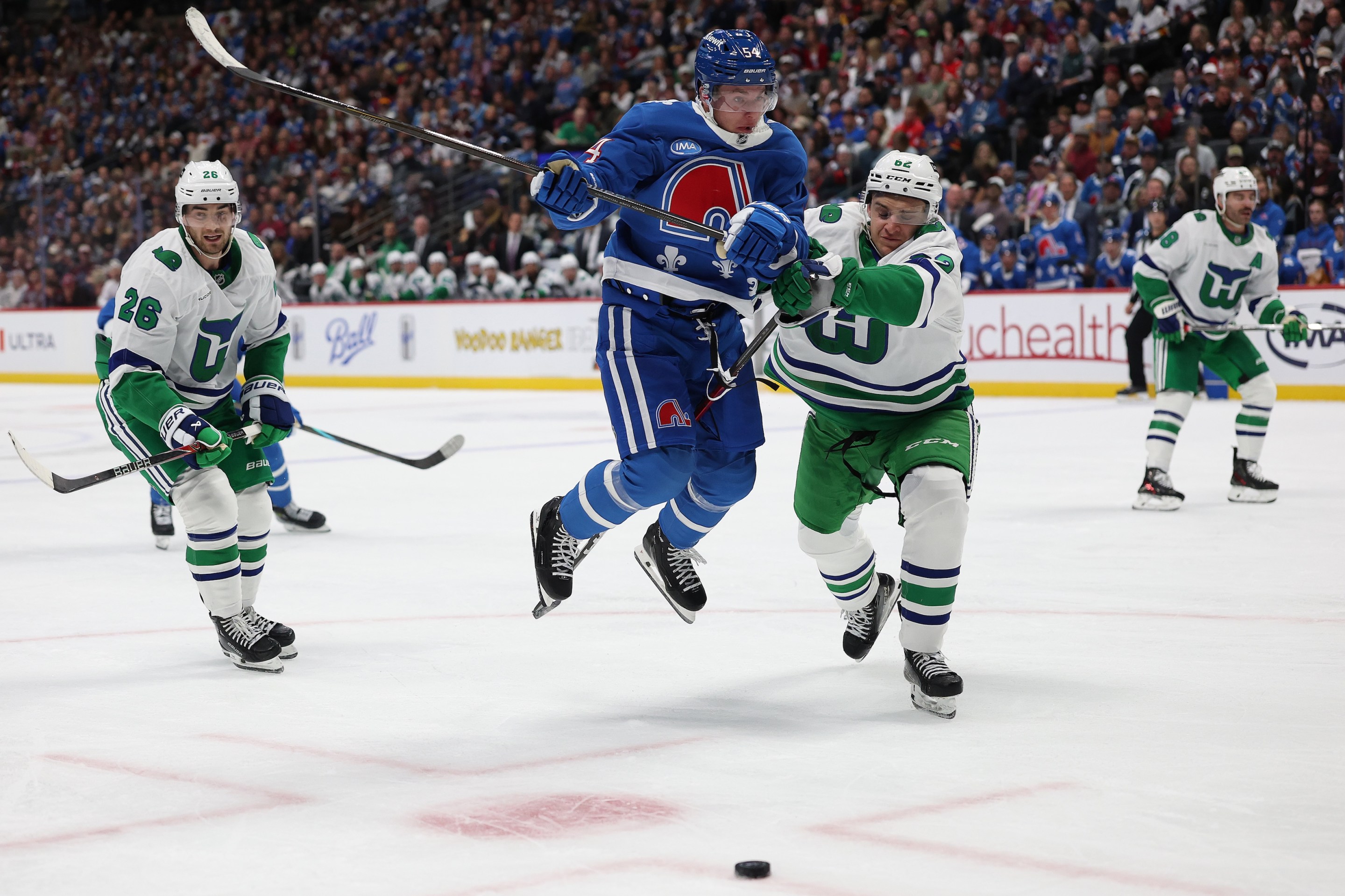
Carolina let a 4-1 first-period lead slip away before Seth Jarvis scored the only goal in a shootout, and both teams picked up the points they needed to maintain their division leads. Much more importantly, this was one of the Avalanche's chosen nights to wear their 30th anniversary Nordiques uniforms, and in both the teams' meetings this season, the Hurricanes have elected to don those nifty Whalers throwbacks they've had for a couple of years. Put 'em together and you get some legitimate jersey magic—not reliant on sentimentality to be easy on the eyes:
"It's something that us as players have been wanting and asking and begging about for years," said Colorado's Gabriel Landeskog. "I'm biased, but it's the best-looking uniform in hockey[.]" Well, I'm not biased and he's right. But that's also an indictment of the current uniform situation across the NHL. Buddy, it is dogshit out there.
The primary color match-ups of Oct. 23: white vs. black; white vs. orange; white vs. red; white vs. dark blue; white vs. dark blue; white vs. dark blue; white vs. gold; white vs. dark blue; white vs. dark blue; white vs. dark blue; white vs. green. The NHL remains, in large part, hostage to fashion trends of the 21st century—dingy, muted colors, and so, so much black. These may look less dissonant when purchased in a team store and worn to the supermarket, but actual hockey games are a different story. Games cry out for explosions of color—for things that pop, on television and in person.
Again, this is not an argument for nostalgia. It is not a claim that things used to be better just because that's the way they used to be. Things are actively getting worse. Consider the league's newest teams. The Mammoth have a lovely sky blue as one of their official colors; they made their home jerseys primarily black. The Kraken feature an arresting ice blue; their home jerseys are black. Their third jerseys are even blacker. It's not hard to imagine, and to long for, what a WHA team might've done with either team's palette.
There are a few easy fixes to make NHL games a little more visually interesting, especially in person. 1. Go back to home whites. Let people see the visitors in full color! This was reportedly raised in recent CBA negotiations but led to nothing. 2. Allow color vs. color. We see a bunch of it in international competition, and it's almost always superior. It feels like it'd be a pretty simple thing to disallow only those color pairings that are just too similar. 3. Remove the Ducks and Hurricanes from the league until they can create primary uniforms that don't suck ass. They've had three decades to figure it out!
But those won't solve the larger uniform malaise. That'll take individual teams bucking trends and returning to brighter, less attitudinal color schemes. We know some of them already have options. Nothing is stopping the Avs from adopting their Quebec palette full-time, even if they move on from the pseudo-elephant and fleurs-de-lis. The Wild have a blueprint in their reverse retros from a couple years back: current Wild logos in North Stars green and gold. The Penguins can fall back on their historic blue, but it must be the original powder blue and not their watered-down retro reincarnations. The Canucks should—well, I can't help you there, sorry.
The people yearn for color! If it's good enough for special occasions, it's good enough for everyday use.