
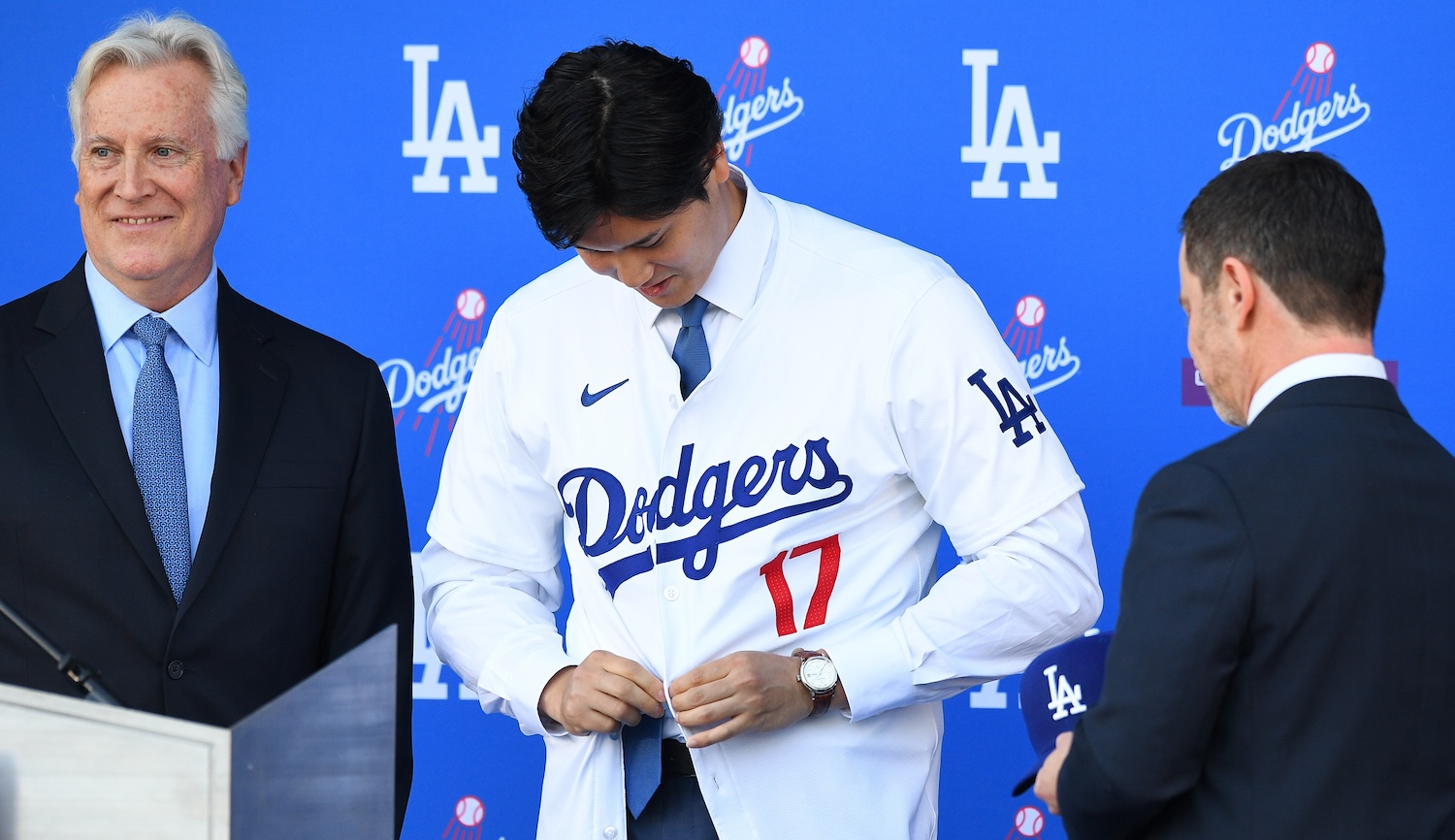
When the Los Angeles Dodgers formally introduced Shohei Ohtani in December, Paul Lukas of Uni Watch noticed a few concerning tweaks to the team jersey for the upcoming season. No single change on its own was major—perforated numbers, smaller letters on the back, off-white instead of white, the odd choice to shift the placket—but they added up. Lukas speculated that the shift in production would make other teams' jerseys look a little worse, especially those with script across the front. This week pitchers and catchers began to report to spring training, which meant more players got their hands on the new jerseys for the first time and were able to see the heinous work up close.
St. Louis Cardinals pitcher Miles Mikolas was not a fan. "I don’t like them," he told the St. Louis Post-Dispatch's Derrick Goold. "Everyone should write about it." Another Cardinals player told Goold that the jerseys looked "generic." The team reportedly had to lobby MLB, Nike, and Fanatics to get them to switch back a few details, like the chain-stitched version of the Birds on the Bat logo for the front, even if it added more weight. But production forced other aspects to change, and a look at the Seattle Mariners' and Milwaukee Brewers' offerings indicate that the Cardinals' are not an outlier. The less-defined lettering and thinner fabric might make these jerseys lighter, but it also makes them look cheaper, like an in-stadium giveaway.
While this is the fifth season that Nike has subcontracted manufacturing out to Fanatics, this is the first year of jerseys created with the new Nike Vapor Premier template. MLB tested the new jersey template at last year's All-Star Game, and shared a video on Tuesday featuring interviews with players who praised their lightness, although nobody has to wear an All-Star jersey every day. The new jersey is designed to be 25 percent stretchier and dry 28 percent faster, per the press release, which also features some definitely real testimonials from players such as Cardinals third baseman Nolan Arenado: "The Nike Vapor Premier jersey is soft, light and comfortable. It’s almost like wearing my favorite shirt out on the field—and so easy to move around in." Was Fanatics also in charge of manufacturing the quotes?
There's a plausible argument that lighter fabric helps with performance, but the new design tweaks are so bad. The MLB logo below the piping, the shifted placket that forces strange letter splits on some teams' jerseys, and the smaller numbers all combine to make for a notably uglier result. While Fanatics is infamous for churning out crappy products, as well as having an avant-garde relationship with spelling, this is not entirely on Michael Rubin's shitty company. Nike gave Fanatics the design specs, so there's plenty of blame to go around.