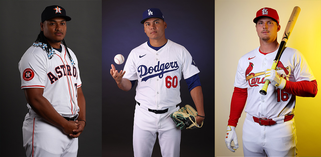
This year, the biggest story in spring training isn't about who's in the best shape of their life or which sadsack team has attempted to turn the page by installing a perplexing motivational acronym. No, the story is and will continue to be about how much the new uniforms suck. The jerseys look cheap. The nameplates are ridiculous. The MLBPA wants this fixed. Nike and Fanatics have created a catastrophe affecting all 30 teams and are being relentlessly criticized and jeered for it. But wait: We haven't even gotten to the pants.
If you thought the jerseys were awful, oh man—the pants somehow surpass that. Only in a technical sense are these really pants. They're effectively translucent, and because of the length of the Nike Vapor Premier jerseys—you have to tuck them in, after all—the players look like they're wearing diapers. For example, look at Cal Raleigh in this Seattle Mariners video:
Cal’s got jokes 😆 pic.twitter.com/rhrDgl6x8h
— Seattle Mariners (@Mariners) February 21, 2024
Even in official team photographs, you can see too much. You can see too much! Poor Casey Schmitt of the San Francisco Giants is showing bulge, with an alarming degree of detail. Mind you, this is how much you can see when the pants are dry and indoors. Sweat, direct sunlight, and rain haven't even factored in here.
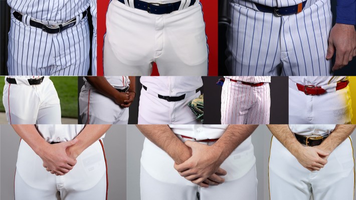
Teams seem to be aware of the sheerness, but unable to do much about it. Paul Lukas of Uni Watch noticed that Mariners players are wearing the new pants for official photos, but switching back to the old ones for spring training workouts. That's the best they can do unless Nike and Fanatics actually make a change.
Player complaints are still rolling in, notably this week from Philadelphia Phillies shortstop Trea Turner. "I know everyone hates them," he said, via the Associated Press. "We all liked what we had. We understand business, but I think everyone wanted to keep it the same way, for the most part, with some tweaks here or there."
MLBPA executive director Tony Clark also went on the record to briefly note how "frustrated" his players were. "Any time there’s change, there’s an adjustment period. Sometimes that adjustment period goes well, sometimes not so much. In this instance, there appear to be some misses that could have otherwise not been misses,” Clark said, expressing what Turner said in the most roundabout way possible.
Last week, MLB commissioner Rob Manfred was asked about the new uniforms and dismissed it as the typical complaint whenever anything new is introduced. He said the uniforms "designed to be performance wear as opposed to what's been traditionally worn, so they are going to be different." But performance wear doesn't have to result in a baseball player's nutsack being shown in a game broadcast on high-definition television. Performance also doesn't need to sacrifice basic design to be optimal. Does a guy's name have to look like the Gateway Arch on the back of his jersey, so that he'll be a tiny bit quicker on the basepaths, or is Manfred ignoring legitimate complaints from players in favor of money? I have a guess. If the new uniform were a unitard, it'd probably lead to better performance, too.
Manfred took pains to say that "first and foremost, these are Nike jerseys," as if to push the scrutiny away from Fanatics, a company that is now notorious for shoddy quality control. The bottom line is that both Nike and Fanatics signed on to design a professional league's uniforms, and now grown men across the nation looked diaped up in even the most forgiving of photography settings. Divide the blame however you want, but it doesn't change the underlying problem.
