
I met my friend Molly in New York for lunch yesterday. Molly and I, despite our best intentions, almost always order the exact same thing. We almost always go to a diner when I'm in town. Once arriving, we both begin talking so rapidly that we do not have time to look at the menu much. We both claim to be looking at it, but neither of us are. Then the waitress arrives and we both order tuna melts. Luckily, most New York City diner tuna melts are good.
Yesterday, we ordered our tuna melts and Molly gave me some bodega flowers. The Normal Gossip live show sold out so quickly that very few of my friends could come, which made it nice to see Molly. All of this is just a lead-in to talk about these bodega flowers. They were bright orange. "What a fun color!" I said, thrilled. I set them on the table while we ate our tuna melts and didn't pay them much attention.
I carried the flowers to Penn Station, down onto my train. I sat them in the empty seat next to me while I worked on my computer. Before we arrived, I carried them to the little vestibule by the train door, because the train does not stop for very long in Philadelphia and you have to be ready to jump off. While waiting for the doors to open, I was looking at the flowers in my hand. They were so orange. Like Tennessee Volunteers orange, like the color of an orange M&M. But then I noticed something.
It wasn't just the flowers that were orange. It was also... some of the leaves. The top of the stems were also orange. The flowers weren't orange. They were spray-painted orange!
Immediately, I loved them more. What a stupid thing. How perfect.
I say all of this about the flowers because they remind me of the house we are going to look at today. This house was sent in by Elizabeth. She lives with her family in a neighboring town and has been watching Zillow because her parents might move nearby! Not into this fucking house they won't! While a quick and poorly thought out design remedy might be good for bodega flowers that are going to last four days, it is not what you want in a home.
Before we get into it, this house is located in Essex, Conn. The only things I know about Connecticut are: near New York, Yale, and tennis moms (?), so I needed some context. Turns out, I was not entirely wrong. Elizabeth told me that Essex is "generally considered to be the gas stop between New York and Cape Cod." Okay, good to know. She also said that, "Architecturally we see a lot of colonials, capes, and farmhouses. Love a converted/reclaimed and modernized structure, and don't mind if it retains *some* of its original charm. But not like this. Never like this."
Are you scared? I'm scared. Let's get into it.
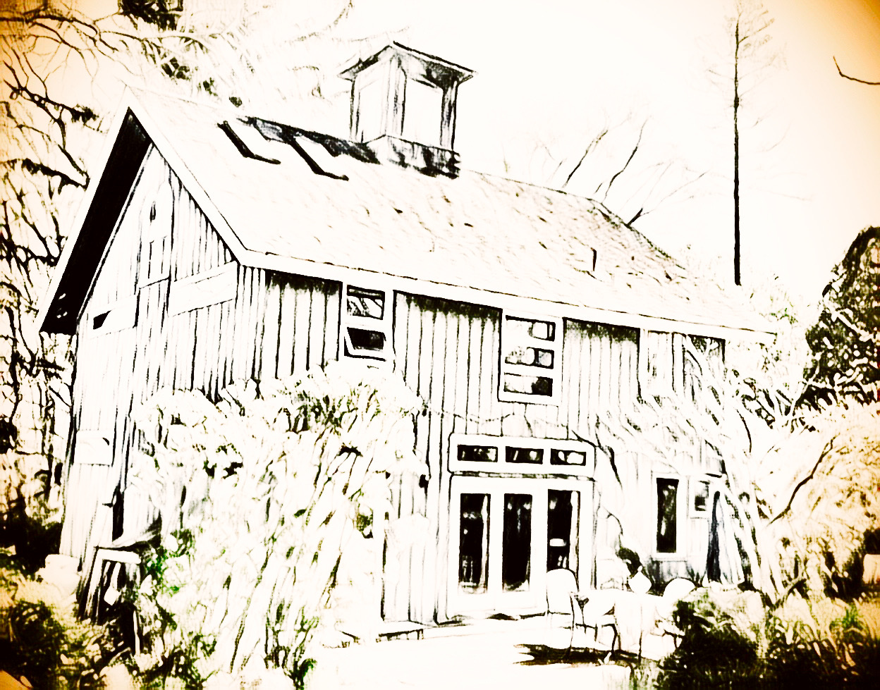
At first glance, this seems okay to me. Maybe even good. I like the color, and I like the little lookout/crow's nest. I'm a little afraid of how that window on the right seems crooked, but I guess we could call this charm.
This house is two bed and two bath, sitting on 2,246 square feet. It was built in 1880 (fun!) and sits on a little over a half acre. It is listed just under $1.1 million. Because the real estate bubble is so inflated, this didn't raise a red flag for me, but it did for Elizabeth. "$1 million isn't an outlandish price for a home in this area, but usually they are MUCH closer to the water. Like, 'the Connecticut River is your backyard,' closer to the water," Elizabeth said. "This house should be $700,000. Max. This [other] house is the same price, closer to the water, and more than twice the size." If you like nice things, I suggest you stop now. Just click that other link. Don't come with me inside. Save yourself.
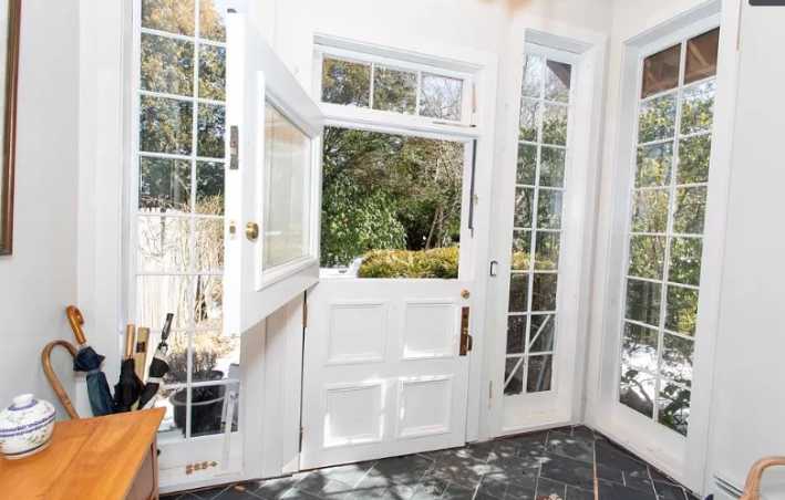
At first, things seem okay. I am always skeptical of a house listed at this price point that has photos that look like they were taken haphazardly with an iPhone, but I do like this entry way. I like the tall windows. I really like this slate diamond patterned tile floor. I don't know what these doors that only open on the top, like you're expecting a horse to drop by, are called. But I find them exciting.
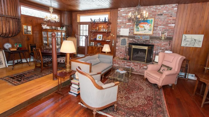
Just past here, we have a big entry room:
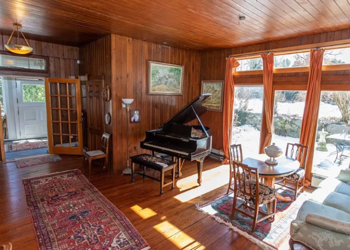
Now, I am not the kind of design girly who (very popularly) hates all wood and thinks it should be painted over immediately. I actually like this room a lot. I think the big windows are beautiful, and I like that they open onto the patio. I like that the ceiling and the walls and the floor are all the same kind of wood. I think a really big rug and a few big paintings could do a TON of work for you in here. There are many options to work with this room. You could paint the ceiling dark. You could get really bold (not wood) furniture. You could get a great big chandelier.
But what is...that?
Oh no. No. No. No. No.
It's the kitchen.
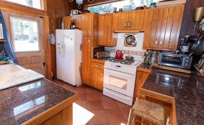
Elizabeth HATES this room. Makes sense to me! A lot of bad decisions have been made. I do think you can make wood cabinets look cool and sleek, but rooms need cohesive and thoughtful contrast. The counters (if you can call them that) are too light or too dark. They need to choose a direction and I hate that they are tile. I guess this is technically acceptable but it hurts me.
The terracotta tiles are lovely, but they don't look sealed and they are clashing with the wood. The white appliances are ugly. Most appliances are ugly, but these have a very "rental unit near a college frat house" feel to them.
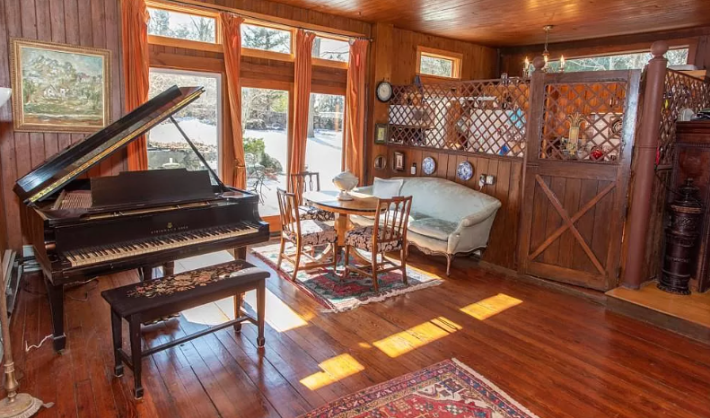
But the actual kitchen itself isn't the problem. It's that damn lattice wall and door we saw on our way in.
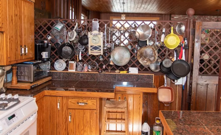
By now, you are all well-versed in my hatred for open-concept floor plans. I did not know there was something I hate more but here it is: open floor plan with semi-open dividing walls. WHY! WHY!? Choosing to hang the pots on this lattice that looks flimsy? There are... so many cabinets in this kitchen. Why do you need to do this? Why is there this weird door? Why is your kitchen a jail cell? All of this is extra upsetting when you notice that the ceiling is so beautiful. The half-wall behind these terrible cabinets and under the awful lattice is made of beautiful wood. Why is it hidden?
No thanks!
After this, we have... more of the same big open room?
It is very interesting to me that even the person taking the photos knows that it is best if you pretend none of these spaces are connected to each other. Might I suggest a tried-and-true method for making that feel more realistic: REGULAR FUCKING WALLS?
Someone at some point decided this must all be one room and now we must be cursed by it. Now, the wood floor is no longer matching. What happened? Who changed this floor? Why didn't they change all of it? If you're going to take out the floor that matches the wood ceiling and wall, you should simply choose any floor that isn't wood, but what do I know.
There are two weird cage things suspended from the ceiling/wall in the dining room section. What are they? I tried googling "wall cage" and "old house cage" and lots of other variations of this. I even checked a book one of you told me to buy but that I have not read yet, but it didn't have anything either. I'm forced, then, to reserve judgement, but my heart says "no."
That's enough of this. Let's go upstairs. Where are the stairs? I don't know. It's unclear. Here's a bedroom:
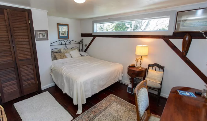
It's boring. The ceiling looks weirdly low. Here's a bathroom:
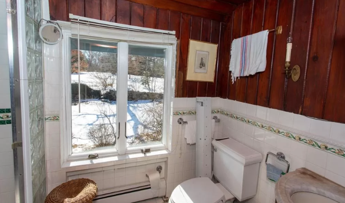
There are three photos of this bathroom, but I promise you only need this one. It contains: A window set back without equal framing on each side; An uneven wire; A weird old light fixture shoved in the corner; A sink so tiny you would certainly get water everywhere; A tile with an accent that matches nothing; A toilet paper roll basically on the ground; Glass bricks that are completely unintegrated in the design; and a shower but no bath. Wood on the ceiling in a bathroom, seems like a very bad idea to me. My opinion is supported by the fact that one of the beams looks rotted. Ew.
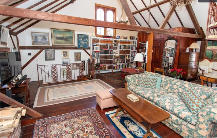
Oh good. Just what we needed: ANOTHER GREAT ROOM.
You may notice that the stairwell is open. That's good. We can have all the noises from both our great rooms at once.
Here we have some more terrible things. The support beam for the vaulted ceiling that runs through the middle of the great room is bad. It breaks up everything visually. Yet again I am begging people to consider just one single regular wall. The window, which is very lovely, seems to be off-center. In a house full of wood, the book shelves are white and have a ruffle trim. None of the furniture looks like it was picked out by the same person. There is ANOTHER structural beam supporting the wall jutting out three feet. Imagine the shin bruises we could get.
Turn around and what do we have here?
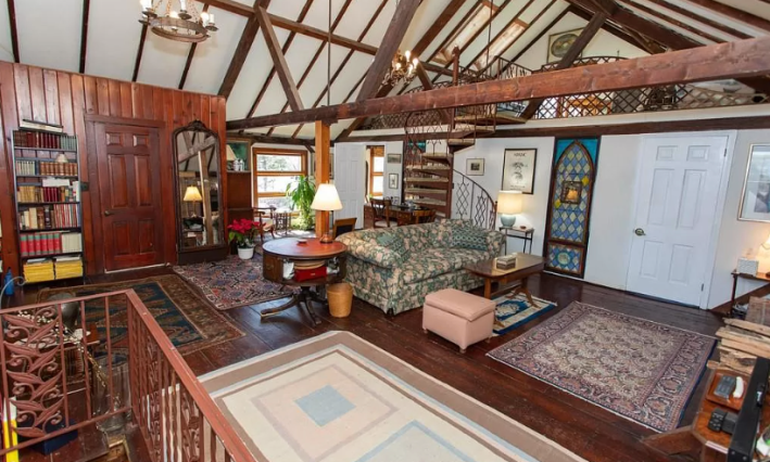
That sound you hear is me banging my head against my desk over and over again.
Okay so here we have one regular wall. Sadly, it looks ridiculous because there are no other walls. On top of this room, we have another room with no walls. How great can a great room be? This house is really trying to find out.
Inside that wall is another bedroom. It's boring, so we won't look at it, but I do want you to know that it has carpet. I also want you to know that the stained glass window you see there in the wall is a REAL WINDOW that you can see through that faces the bed. Totally normal.
Those spiral stairs? They are also carpeted. Their center support pole? It is topped by a horse hitching hook.
You might be asking yourself: does the railing up there on that weird ceiling room match the railing on the spiral stairs? No. None of the railings match. The one coming up from the living room is floral. The one up to the bedroom is a weird web. And the one actually on the third floor is ANOTHER KITCHEN TRELLIS. You could 100 percent push that trellis over by leaning on it, so not only can you hear everything in this room, and obtain a lot of shin bruises, you could also lean wrong and fall. Just what everyone wants!
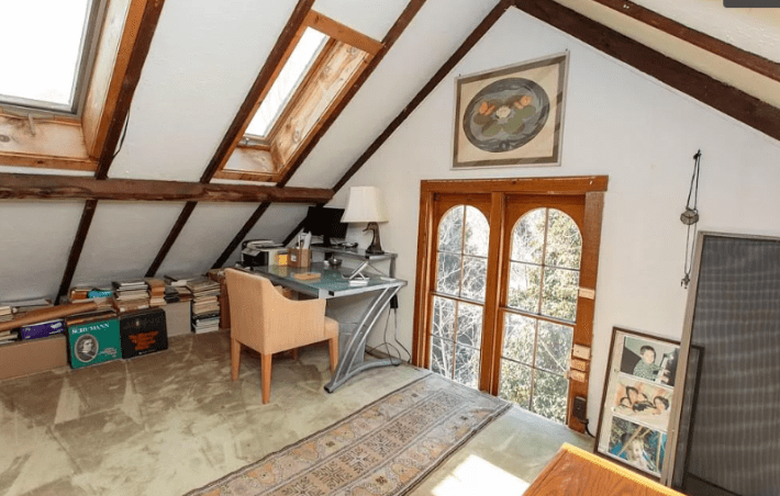
Up here in the loft we have... carpet. Great. We have another large window identical to the one on its opposite wall. But we've bisected this one with this loft space so now it looks like shit. There are some skylights up here that open, so you could accidentally flood your office. Exciting! Danger! I hate it all so much.
Back downstairs, I found another bathroom:
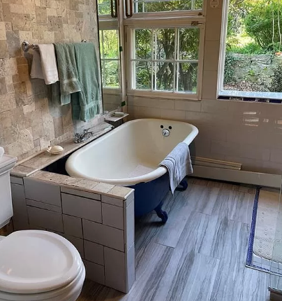
There is nothing better than ruining some perfectly nice classic piece by surrounding it with stupid shit. Why is this half wall here? It's not hiding anything from the person in the tub. Why does this tub, which is big and beautiful, have a spigot that looks like it belongs on a sink. Why, after all the beautiful wood in this house, must I be tortured with this shitty laminate floor?
Let's get out of here.
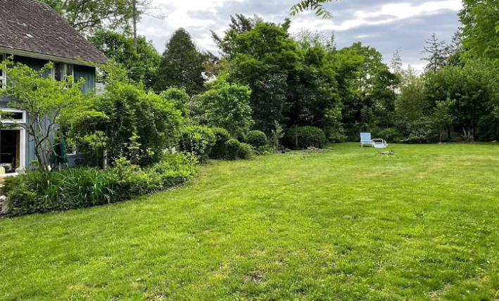
Ah. This is nice at least. Let's lie in the lush grass and maybe the terrifying lattice and awful bisected windows will disappear from our consciousness. Maybe we can leave this house with the reminder that it's fine to cut corners on a bouquet of flowers, funny even. But on an 1880s barn, on any house really, the cuts will only pile up until you're left with a jigsaw puzzle of a house where all the charm is over-shadowed by bad choices.
This week's house has been listed on Zillow for $1,099,000 for eight days. If you buy this house, email me. I have some ideas for how it could rule if you have an unlimited budget.