
In many ways, the Women’s Tennis Association should be ideally positioned to benefit from the recent surge in enthusiasm around women’s sports. One hitch here is that many people who enjoy women’s tennis do not actually know what the WTA is. Tennis is a fractured sport operated by a number of governing bodies, split into many tiers of tournament, and broadcast across many different channels. To a casual fan who might enjoy Wimbledon and the U.S. Open, it isn’t obvious that the sport is also happening in the intervening months, all year long, or that those intervening tournaments are operated by the WTA. That’s the essential challenge of trying to sell the WTA: crafting a coherent identity for a highly decentralized game played by solitary athletes locked in zero-sum competition.
The WTA has decided that now is the time to take that task head-on. On Thursday, the organization announced its second rebrand in the past five years. This move comes at a vexing time for the WTA: The quality of play is as good as it’s ever been, as are the personalities and rivalries at the top of the rankings. But the tour hasn’t been proportionately successful in selling that to fans, and top players have openly criticized decisions on scheduling, venue choice, and leadership. Marquee events, like the year-end finals that showcase the best players in the world, have been staged in ramshackle venues, or petrostate arenas so devoid of fans that people had to be paid to attend. Elite players haven’t been shy about voicing their discontent.
“I really feel disrespected by the WTA,” current world No. 1 Aryna Sabalenka wrote in 2023, during a dysfunctional WTA Finals in Cancun. Iga Swiatek, the world No. 2, has spent the better part of a year complaining about a revamped tour schedule that extends the length of 1000-level tournaments and leaves players even fewer off-weeks between events. “These rules have been changed without us even knowing about them,” Swiatek said after her first-round match at the 2024 U.S. Open. "We spoke to WTA about it that we want to at least be in the loop. But it would be nice for us to have some impact, because I don't think our sport is going in the right direction."
There are also signs of financial unease. In 2023, the WTA spun off a separate company called WTA Ventures, which would be in charge of the tour’s commercial interests: sponsorships, broadcast rights, and data rights. At the same time, it announced that a 20 percent stake in that venture arm had been sold to private equity firm CVC Capital Partners, for the surprisingly low figure of $150 million. It looked like a move made by a cash-strapped organization in need of a timely injection of funds. The WTA had taken a huge financial hit with its temporary boycott of China—prompted by concern over the welfare of Chinese player Peng Shuai, who had accused a high-ranking CCP official of sexual assault—and was looking for a way forward.
Amid these existential problems, the WTA has settled on a visual refresh, to reassess what it actually is and how best to sell that to the overstimulated masses. That effort is long overdue. As someone reluctant to credit a governing body of professional tennis with any forward-thinking decisions, I think it's at least trying something interesting this time. The team tasked with reevaluating the WTA’s visual identity was the London-based brand agency Nomad Studio, which had previously worked with sports clients like Tottenham Hotspur and MLB. Employees at the agency walked me through the rationale behind their design decisions. How do you get a terminally nostalgic sport to look ahead to its future? And is there a lot of pushback from the higher-ups?
“I felt people were hungry for this, which kind of surprised me, because I think they come across as a conservative organization. But we really have had very little resistance throughout the whole process,” said design director Natalie Doto. “Even the board meetings with lots of people of various backgrounds and ages, there was a universal appetite for a big change.”
Some of this strategy is subtle, such as using the word “league” rather than “organization” in internal conversations about the WTA. Other moves were more overt. The agency wanted to change the way the WTA presents itself to the outside world, too.
“The WTA previously, and women’s sport in general, almost talk about themselves like they’re charities, in a way. That was something we have actively avoided,” Doto said. “A lot of the design decisions that we’ve made are about trying to reframe the perception of women’s tennis as ‘charity, purpose-led’ to ‘a sport that’s watched for entertainment, because it’s amazing.’” The word “unapologetic” came up frequently in our conversations.
That’s tricky territory, because unlike many corporations masquerading as agents of social change, the WTA does have a genuinely rich history there. Billie Jean King is often treated as the human embodiment of that history. In 1970, she was one of the “Original 9” players who left the previously existing tennis tour to start what would eventually become the WTA; she also would become its first president. King successfully lobbied for equal pay at the U.S. Open, a policy eventually adopted by all four majors. The WTA’s previous rebrand, in late 2020, was heavily oriented around that history and the 50th anniversary.
In the agency's research for this project, King was asked if there was anything sacred, anything about the brand that they had to preserve. “Just blow it all up and start over,” read the King quote on a slide deck I was shown. She appears remarkably open to whatever will get money and eyeballs in women’s tennis; she's also been supportive of the tour’s enthusiastic embrace of Saudi Arabia, a move unpopular among many players past and present due to the country's treatment of women and LGBT people. The King argument, broadly speaking, is that nothing in Saudi Arabia will change without engagement from the outside world. The counterargument is that the WTA has had a tournament in Qatar for two decades, and it'd be hard to chalk up many wins for gender equity.
While those geopolitical details are sorted out, one can always tweak the color scheme. To move past this sports-as-charity framework, the agency tried to break out of the usual visual language of women’s sports altogether. As an illustration of this point, I was shown a color wheel, one continuous rainbow gradient. The logos for 23 women’s sports leagues were dropped in the corresponding location in that gradient. There are a few stragglers on yellow, red, orange, and pink; there were some on blue. Mostly, there was a pile-up of purple logos, and the WTA was one of them. “We’ll never be able to transcend the category of tennis and women’s sport if we just have a purple brand,” said Doto. The green sector of the color wheel had been largely unexplored, so they added a tangy green to pair with their eggplant purple.
The agency also looked outside sports altogether. Other aesthetic reference points included gaming and streaming entertainment, which have obviously been successful at dominating human attention in the 21st century. “Hardcore tennis fans will watch tennis no matter what,” said Doto, emphasizing that the color overhaul is meant to draw in a younger, newer cohort. On that theme, some of the color gradients in the rebrand were inspired by the power-up bar in video games, "when you're kind of at your absolute peak and you're full of energy,” Doto said. There’s also color-coding to indicate the relative importance of the different tournaments: 125 (deep purple), 250 (light purple), 500 (silver), 1000 (gold). A lot of the screenshots I’ve seen wouldn’t look out of place in a fighting game; Doto mentioned the fighting series Tekken as a reference point. All that's missing is an HP bar.
As for why the new WTA logo has removed the image of a tennis player, Doto said the studio was following the model of, say, Netflix or F1: purely textual, less obtrusive, and better able to travel into different visual contexts. This smaller WTA logo will also take precedence in animations that will be used in broadcasts, which is no small thing in a sport overladen with corporate sponsors, to such a degree that even the geographical names for tournaments can become an afterthought. The agency hopes that fans will develop a positive association with the WTA itself. As a cautionary tale, Nomad strategist Isabel Maguire pointed me to the infamous image of Rob Lowe in an NFL hat; they want fans to develop a positive association with the WTA as a whole, so that the analogous hat wouldn’t be quite as bone-chillingly swagless. While the WTA has a different history than other businesses, this is fairly common corporate aim: to to evoke some warm and fuzzies.
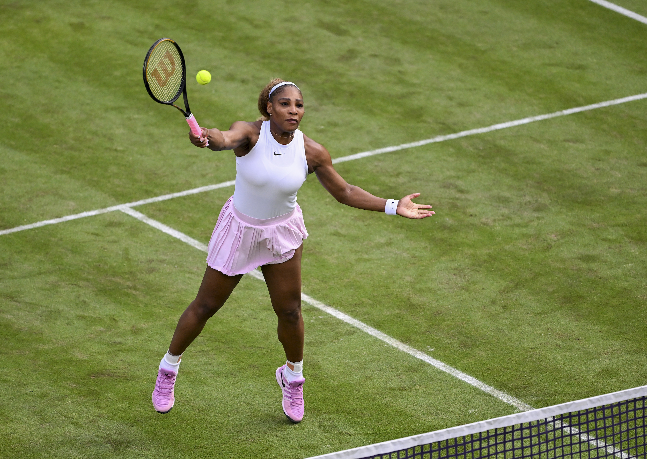
The goal of all this, I was told, is to emphasize the players themselves. “The players are in the forefront, making them look powerful, athletic, formidable,” Doto said. “Rather than before, where they were slightly buried behind the brand and the messaging.” She referred to the new player headshots, taken this year in Australia, as “hero” portraits, styled with high-contrast grading, meant to evoke “entertainment superstars.” Anyone who was featured in the TV series Break Point, which aired for two seasons, now has a little Netflix logo on their official player pages. A promo video for the rebrand has players announce that "This is not a tennis court. This is our stage." Players were interviewed at the outset of this project and have been kept updated on its progress. This hasn’t been true of all big decisions in recent WTA history, including the scheduling of its second-largest tournaments, so that’s saying something.
As someone who has always enjoyed the undercurrent of combat in tennis, is fond of neons and purple, and has not seen much improvement to the average tennis broadcast over the last decade, I am not complaining about this. It feels fresh without feeling thirsty. The rebrand will not cure all that ails the WTA; that requires resolving player dissatisfaction, filling seats at tournaments besides the majors, making sure that fans have reliable ways to watch the sport, and, perhaps, finding investors more in line with your organization's stated values than the sovereign wealth fund of Saudi Arabia. When top players are complaining about their tournament schedules, you can't just tweak the colors and scorebugs and call it a day.
Growth goes deeper than the aesthetics, and into a question of rights: Who is allowed to broadcast this footage of amazing athleticism, and who is allowed to chop it up and make it fun to a curious audience? Those are the real chokepoints that will limit the WTA. In 2025, highlight reels are the basic unit of normie interest in any sport, and tennis is walled off to a degree that is counterproductive. The WTA's social media strategy is far less aggressive than what the ATP tries with its streaming platform, Tennis TV. Even on a day when the WTA action was superior to the ATP's, a tennis fan is less likely to encounter clips of women’s tennis during their ordinary trawl through the internet. I’m confident that Aryna Sabalenka's backhands or Coco Gauff's foot speed are the best possible advertisements for the WTA. The organization—sorry, the "league"—needs to make sure that prospective fans can encounter them in the first place.