
Welcome to the Scorebug Snuggery, that place we all know of and recognize, where we discuss the artistic merit of scorebugs on sports television broadcasts. Today, we look at the Fox network's new scorebug.
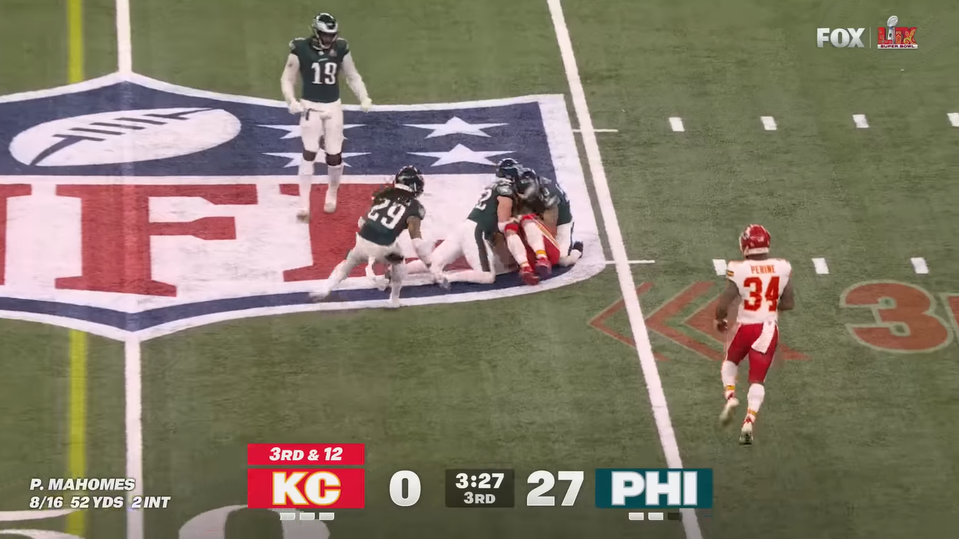
Sunday night's Big Game was one of the least suspenseful Super Bowls of the 21st century, and thus, while watching, I had plenty of time to contemplate the scorebug. Debuting on Fox was the design seen in the screenshot above, replacing the old model, displayed below in the NFC Championship Game:
Outlets from Awful Announcing to Us Weekly aggregated social media posts to deride the new scorebug as a flop. But here in the Scorebug Snuggery, our opinions are our own. What follows is an independent analysis of the Fox scorebug's qualities, ranked on a scale of zero to five light-up timeout indicators.
Size: My ideal scorebug is still something as unobtrusive as this:
I'm a low-maintenance girl with simple desires: I merely wish to know the score and time, with as little fuss or distraction as possible. It's a strange paradox, to the minds here at the Scorebug Snuggery, that as the average television gets larger, so too do the scorebugs. We can read smaller print just fine on these massive screens, thank you very much!
This Fox scorebug is not so monstrous as the ad-cluttered bars available on channels like ESPN or "FanDuel Sports Network." In fact, I even admire its use of negative space to show us a glimpse of field beneath. But the unfortunate reality is that this was a big, bold choice for a viewing aid that is not supposed to be the main attraction. The more the scorebug calls to you, the less attention you're paying to the real stuff. 1.5 out of 5 light-up timeout indicators.
Creativity: It looks different, I'll give it that. While the sheer heft of the thing contradicts its minimalist ideals, there's still a legible no-frills philosophy at play here. Unlike its predecessor, the shapes are limited to confident rectangles, and its designers restrained themselves from using any color except as an instant identifier for the two teams. I liked, also, the choice to avoid any kind of digital bar shooting out from the bug to display stats; the numbers instead were just placed in the corner with an implied connection to the team name. I appreciate the effort here, even if the execution was iffy. 2.5 out of 5 light-up timeout indicators.
Beauty: A complete misfire. If your goal is the efficient communication of information, why use extraneous letters in an ugly font instead of each team's logo? The more important part of the stop sign, for a driver trying to take in a wave of visual stimuli all at once, is the red octagon, not the literal word "STOP." Fox could have applied that principle to much greater effectiveness here. It doesn't help either that "KC" and "PHI" look like they were somehow enlarged from a smaller, lower-resolution graphic. 0 out of 5 light-up timeout indicators.
Functionality: Unlike, say, the TBS bug from the MLB playoffs, there was nothing particularly confusing about the actual act of reading the Super Bowl scorebug. I wouldn't exactly call it a breezy experience, but its design wasn't misleading or frustrating, either. It did its job. I knew the score. 4 out of 5 light-up timeout indicators.
Verdict: The brutalist scorebug is an intriguing idea, but it is undermined by the maximalist execution. The concept is modest, and its presentation is anything but, resulting in a mish-mash of intentions that will, hopefully, be addressed before the start of next season. Final rating: 1.5 out of 5 light-up timeout indicators.