
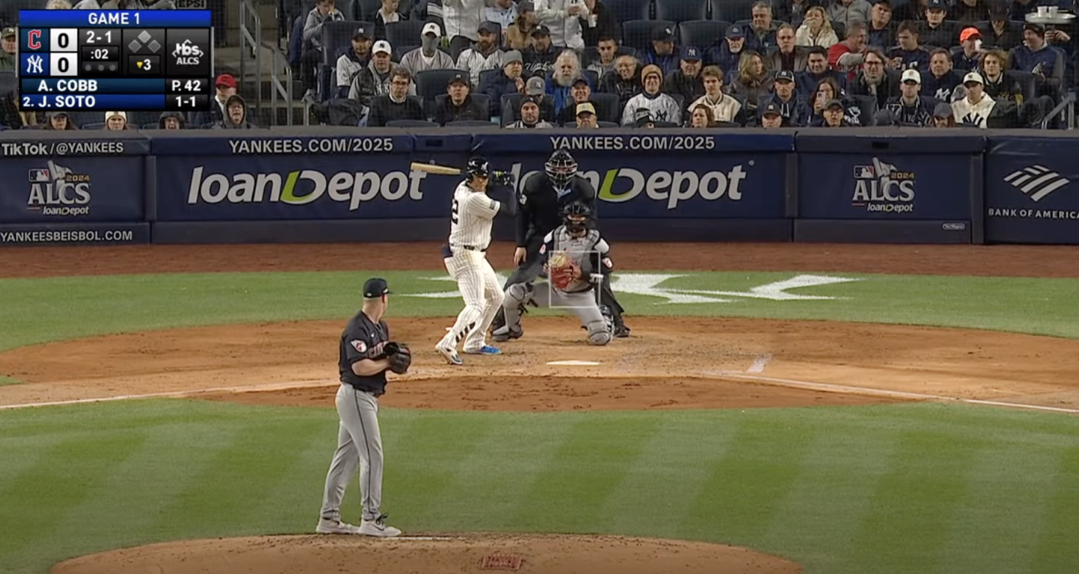
Let us say—just as an example—that you were switching back and forth on your TV Monday night, between the ALCS and your favorite hockey team during commercials. Let us pretend, in this scenario, that you did not always switch back to the baseball game in time for the start of each inning, and sometimes missed a few pitches. Let us also imagine that at the start of the bottom of the third, you tuned in just in time to see Juan Soto crank a ball just over the wall in right-center. As he rounded the bases, you would naturally have turned your eyes to the score bug in the top-right of your screen. There, at first glance, and also second and third glances, you would notice the little bases graphic has second base a different color than the other two—lighter, filled in. You have been conditioned by a lifetime of score bugs to know what this means: There was a guy on second! Soto's was a two-run home run!
But no. It was a solo shot. The TBS graphic is just like that. It makes it look like there's always a runner a second.
Several times during TBS's coverage of the AL playoffs, I have thought I was losing my mind when I believed there was a runner on second, when I didn't remember such a thing happening in the inning I was watching. I guess I chalked it up to distraction on my part or a glitch on theirs, but last night, when it kept happening, I got up close to confirm:
There's some kind of weird gradient under the graphic, but with the translucent bases it makes second appear lighter than the corners. Why? What is the purpose of this if not to confuse? It doesn't look any better.
Watching any sports besides the NBA on TNT Sports—formerly Warner Bros. Discovery Sports, formerly Turner Sports, formerly TBS Sports—already feels like a second-rate production. And humanity has been trying and failing to perfect the score bug since its invention in the shockingly recent year of 1992. But TBS's is notably bad. Too much going on. Less real estate given to important things like the score and the count than to the channel's logo. Unnecessarily showing the batter's performance so far in that game, which looks in many situations like the count—is Brayan Rocchio down 0-1 in the above instance, or is it all square at 2-2? Don't even get me started on the kerning.
But all of that pales in annoyance compared to the ghost on second base. One wonders how many design meetings, how many memos, how many higher-ups stuck their fingers in the stew, before it was decided that the best score bug was a misleading one. The worst part is: It wasn't like this last year. They made it worse!
Are there more important things to get mad about? Sure. Can any of them be fixed, this very moment, by one person in the right place bold enough to say, "Hey, this looks like shit"? Fix the score bug!