A little secret about the pro wrestling television show I like best is that they're always trying to trick me into believing there are more people in their venues. The way All Elite Wrestling sells their tickets (and WWE too, when they're not selling out) is by opening up just a few sections for sale at a time. If those sections go, they'll add more available seats, but if they don't, they'll ensure that fans aren't scattered throughout a gigantic arena. Rather, everyone who bought a ticket will help fill up the place the cameras point at. Your brain, seeing no empty seats on TV, processes the scene as a sold-out building, even if the fans you're looking at are themselves staring off into a black hole.
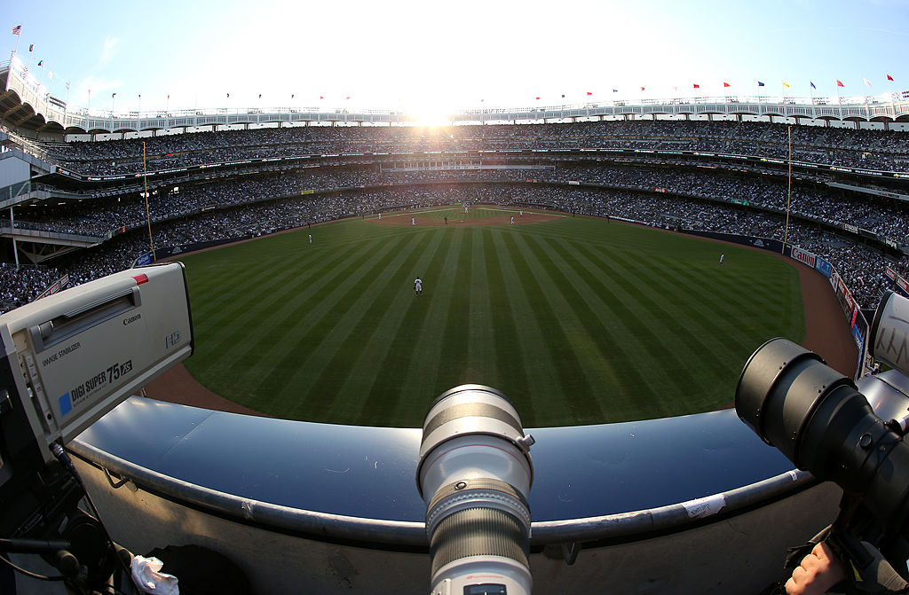
Pro sports teams don't carry this same level of anxiety about appearing unpopular, but it matters. A big game earns its gravitas from a packed stadium of people screaming their heads off. And more than any other sport, in baseball the fans are inextricable from the viewing experience. They're bizarrely intimate, those seats directly behind home plate, because they force their customers to look directly into the game's default centerfield camera.
Those seats used to be relatively uniform across the league. Previously, they didn't give you anything more than a prime view of the umpire's backside. In the 21st century, however, they've evolved into a hive of luxury add-ons and corporate interests. They entitle their owners to special club access. They are saturated with sponsors' logos. When the Yankees moved to their new stadium, this decadence was alien enough to qualify as a controversy—and one that any viewer at home could see in the empty seats.
The fight against turning stadiums into subsidized cruise ships has been lost. But even if the priciest spots are unobtainable to most fans, their aesthetics confront us relentlessly for as long as we watch the home team. For that reason, I was curious about how they differed from ballpark to ballpark.
To be clear, this is not about the camera angle itself; that's been done, and thoroughly. I evaluated the backgrounds themselves, on three criteria:
- Fans: Am I seeing people and not just empty seats? Do the people look like legitimate baseball fans and not just first-class-flying vampires?
- Ads: How many are there, and how distracting are they?
- Beauty: As I watch a game, do I feel at peace? Am I grateful for baseball? Or do the background visuals depress my mood?
To normalize my findings, I picked only Saturday home games on local broadcasts, avoided bad weather, and watched the bottom of the fourth inning to control for late arrivals. This is as scientific as it gets. My results, ranked from best backdrop to worst with a few clarifying remarks, are below.
1. San Diego Padres
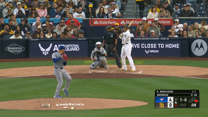
I first looked up a Padres-Yankees game, saw the crowd, and figured "Well, it's the Yankees." But they showed up for this one too!
2. Chicago Cubs
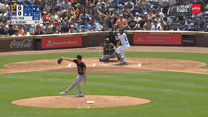
Why is nobody talking about the amiable enclosures of Wrigley Field?
3. Seattle Mariners
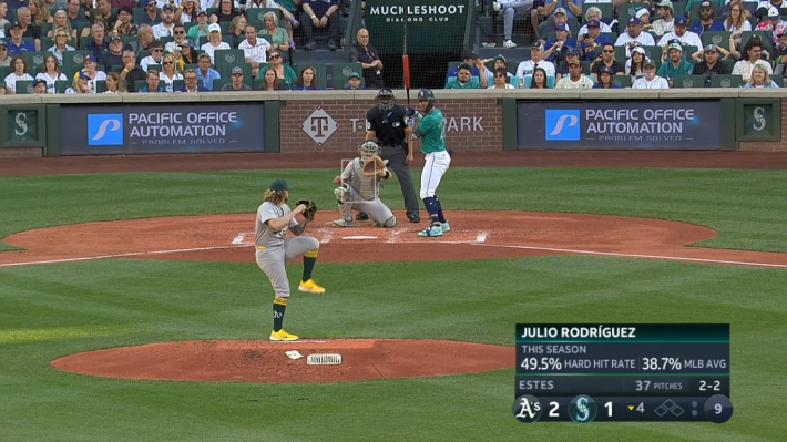
4. Kansas City Royals
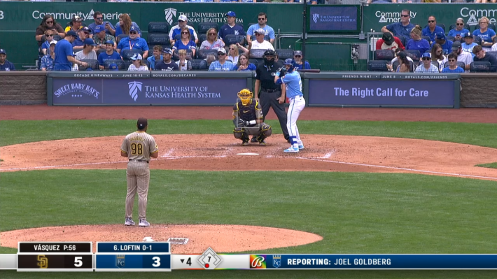
This is understated in a way that I approve.
5. Colorado Rockies
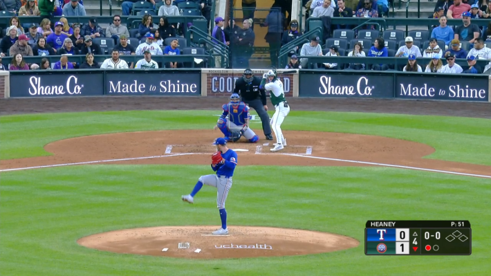
I can almost forget the existence of the backstop and imagine a fan jumping onto to the field. Exciting!
6. Arizona Diamondbacks
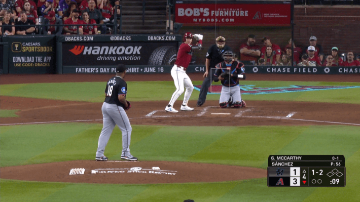
Some of the fans are high, and some of the fans are low. Novelty!
7. Los Angeles Dodgers
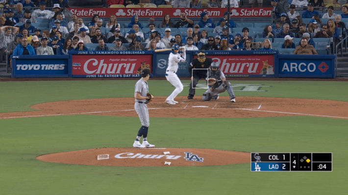
It's so blue! It'd be so much bluer if the ads stayed consistent with the team's aesthetic.
8. Boston Red Sox
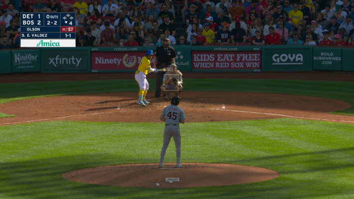
A flawless group of fans undermined by cluttered advertising.
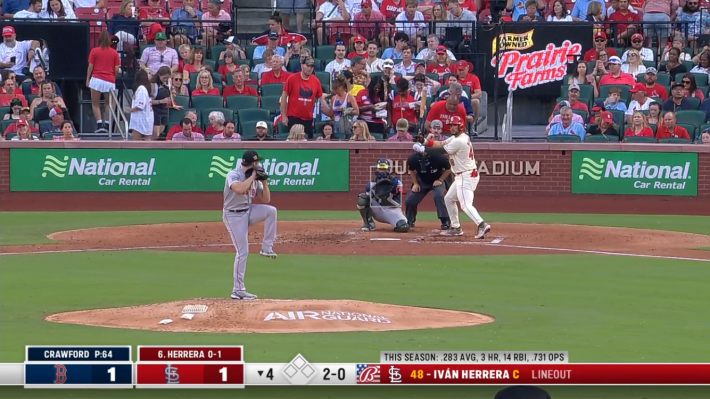
9. St. Louis Cardinals
10. Pittsburgh Pirates
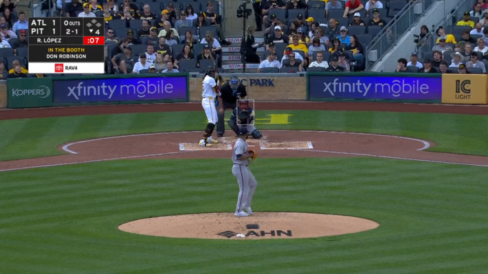
11. Los Angeles Angels
The Angels are helped by the fact that most of these ads are totally inscrutable to me.
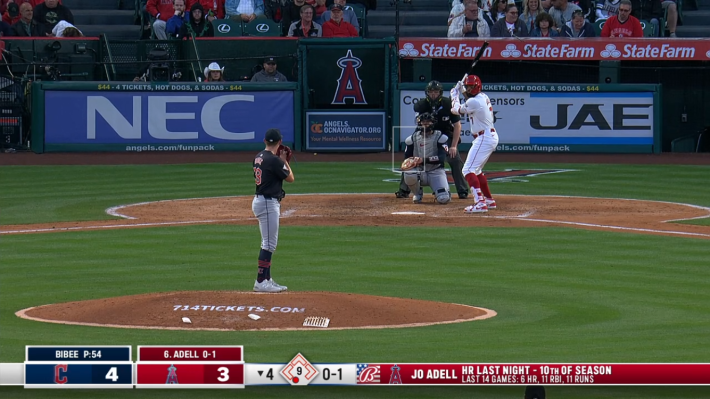
12. Detroit Tigers
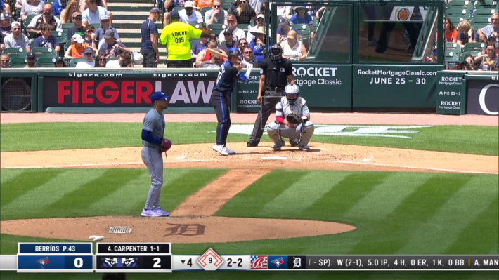
13. Philadelphia Phillies
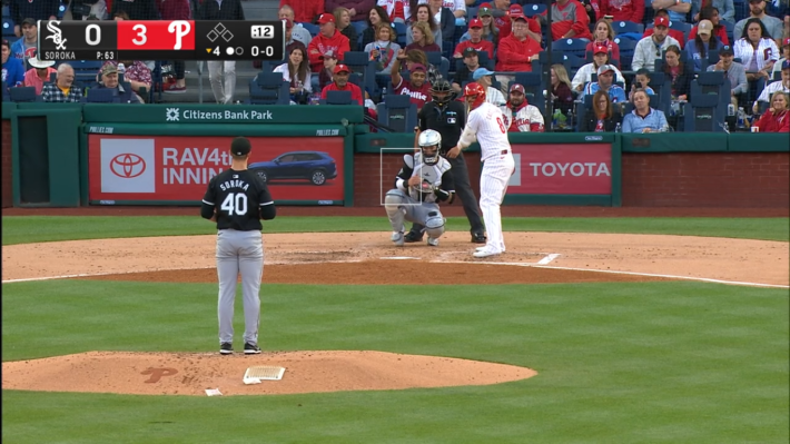
14. Atlanta Braves
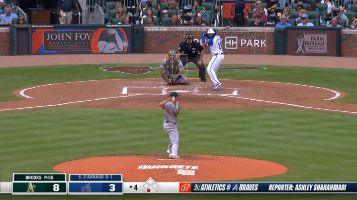
15. Oakland Athletics
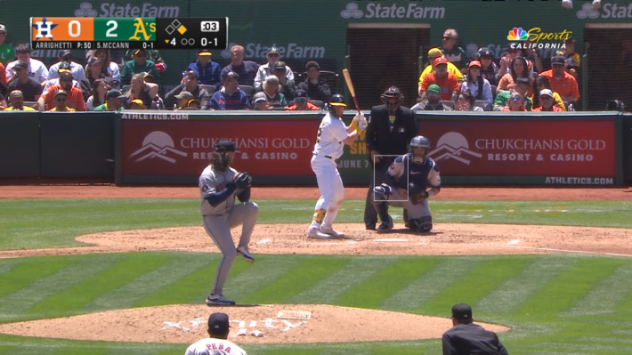
This is the most populated area in the entire Oakland ballpark. Sell the team!
16. Cincinnati Reds
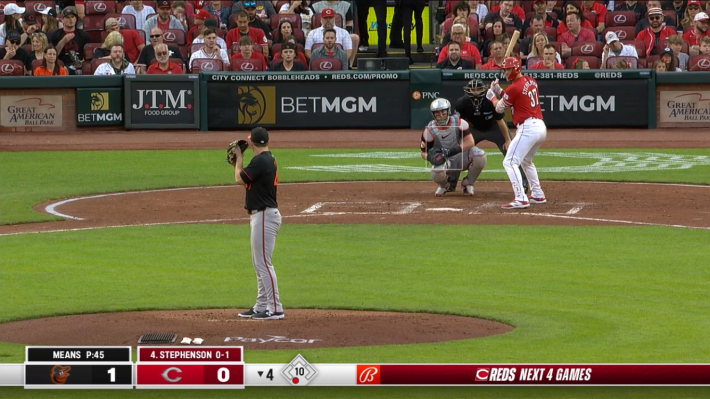
17. Milwaukee Brewers
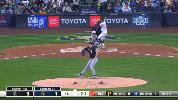
18. Baltimore Orioles
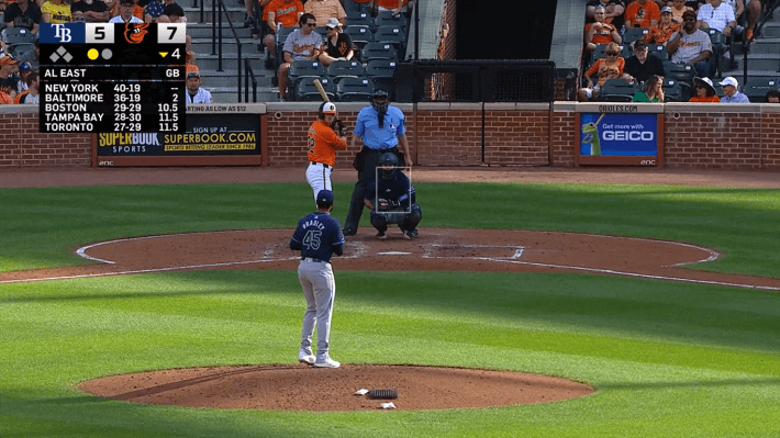
The brick is pretty, but when it's interrupted by off-theme ads it makes me feel worse.
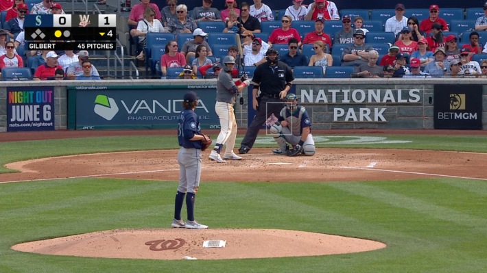
19. Washington Nationals
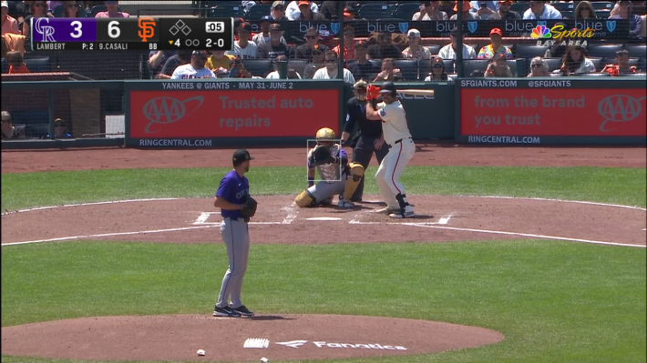
20. San Francisco Giants
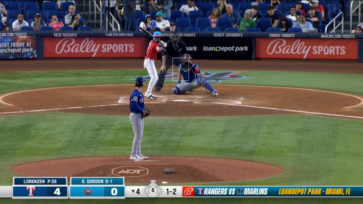
21. Miami Marlins
22. New York Mets
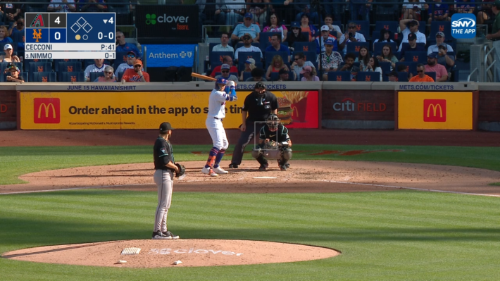
That's not a very mellow yellow.
23. Minnesota Twins
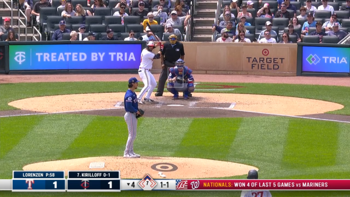
24. New York Yankees
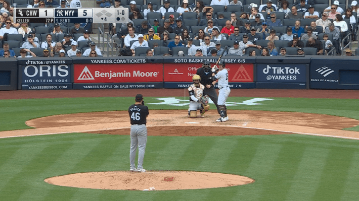
I think there's room for a few more ads.
25. Chicago White Sox

26. Toronto Blue Jays
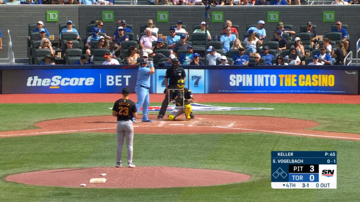
27. Houston Astros
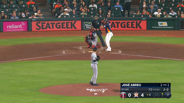
28. Tampa Bay Rays
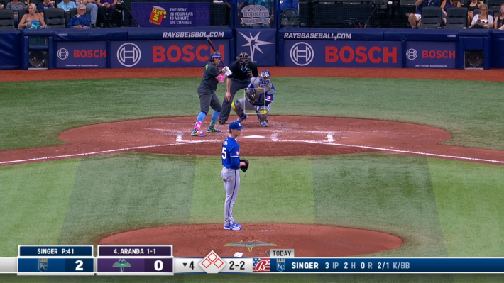
The presence of, like, three total fans is actually kind of funny.
29. Texas Rangers
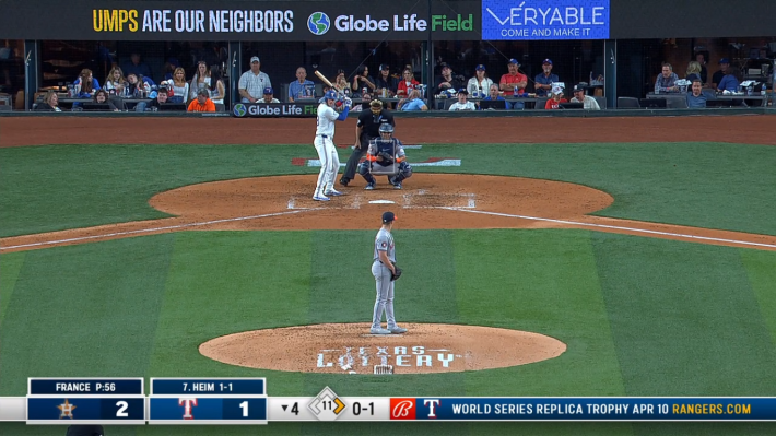
I despise Texas's design. I feel like I'm looking through the window of a coffee shop with a $600 cover charge.
30. Cleveland Guardians
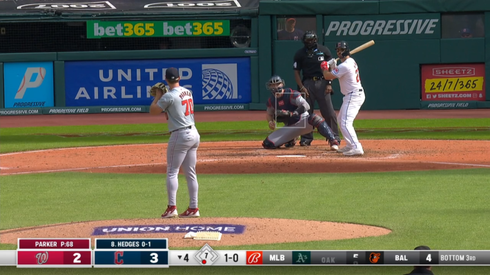
What a beautiful warehouse for baseball. This list is over!
