Every little thing that you've never spared a moment's thought for—let me just take a quick glance around my house for some examples: shoelace manufacturing, microwave button design, cat food nutrition, those little accordion wings on a window air conditioning unit—every thing!—represents an entire industry, and entire swaths of people whose professional lives are devoted to thinking about, knowing the history of, and improving. This tweet, spurred by of all things a wall-mounted handrail bracket, verbalized a wonder I've often felt toward the sheer amount of technical expertise that modern society requires, and possesses. There is so much specialized knowledge in the world! Almost all of it is hidden away in experts' brains so you and I don't have to worry about it, even though we enjoy the fruits.
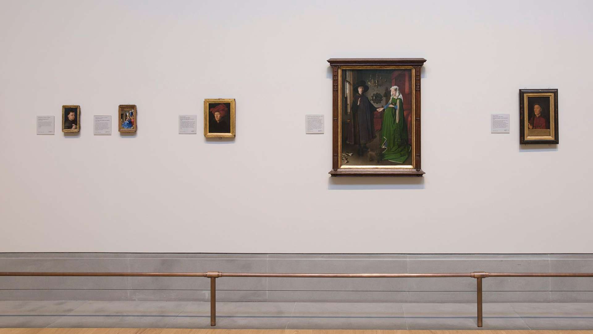
Perhaps slightly less obscure on this spectrum of thought, though certainly still something that had never crossed my mind other than wondering why it costs so damn much to get a poster framed at an art store, is framing. That is, I had not had any opinions on framing until last week, when I saw the recent reframing of Jan van Eyck's Arnolfini Portrait at the National Gallery in London.
Today we re-framed Jan van Eyck’s Arnolfini Portrait. We replaced the late 19th century gothic fantasy frame with a newly acquired somber gilded 15th century moulding. The figures appear larger and the details crisper without the competition of the incongruous carving. pic.twitter.com/wK6bwKnMdm
— Peter Schade (@psframes) May 2, 2024
Not only did I suddenly have takes, but nuanced ones to boot. I admire the simplicity and proportions of the new frame, centering the artwork itself. But I find that I miss the heft and depth of the old one. Does it matter that the gilded frame is era-appropriate if it fails to convey the sense of looking at the Arnolfinis through a doorway, as van Eyck painted them in 1434? Are the distracting shadows of the gothic frame compensated for by its earthier color that makes the painting's reds and greens pop?
Then I realized that these questions are probably entry-level, Framing-101 stuff for people who think about this for a living, and the actual theses they are writing contain topics and considerations that my feeble little brain cannot now even conceive of.
There are worlds out there with no maps to, and it was humbling and thrilling to get a little glimpse of one of them, in the replies to that tweet, where professionals and enthusiasts debate the merits of the Arnolfini Portrait reframing. (And yell at the museum to return the stolen artwork. But though it was most likely plundered from the Spanish royal collection by a soldier during the Napoleonic Wars, it had previously been absconded with from what is now Belgium by the Habsburgs; this is not your typical open-and-shut case of British imperial looting.) I always get a thrill from seeing competent people do the thing they're good at, no matter the thing. But I was not prepared for the depth and variety of rabbit holes that this specific painting could lead me down.
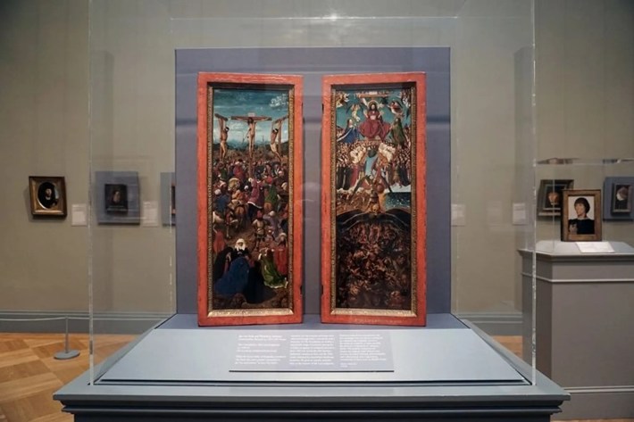
For example: Did you know (as I now do, after I consulted a very excited Kelsey) that in 2019, the Metropolitan Museum of Art in New York decided to study and restore the frame of another van Eyck work, the diptych Crucifixion and Last Judgement. The Met chronicled this process and its findings in a five-part blog series, and let me tell you, I devoured every word. They learned so much! They found secret and mysterious text around the inner parts of the original frames, which had been covered up in an earlier restoration, and that when scanned and translated from Latin proved to be fragments from both the Old and New Testaments, supporting the theory that the original commission for the paintings had been to decorate a reliquary shrine. They teased out details of van Eyck's daytime waning gibbous moon, which is the very earliest known realistic depiction of the Moon, with visible surface features. They discovered that under the gold paint, the original frames had been red, a brilliant vermillion pigment that naturally decays over time to something subtler—so they repainted them in the likeness of that warm, worn red.
I think the red looks fabulous, and supports my inclination to prefer the darker frame on the Arnolfini Portrait.

It was around this time I was fighting off thoughts that I had messed up by not going into art conservation for a living. But that would have closed off entire avenues of art theory! Let us return to the Arnolfini Portrait.
The Arnolfini Portrait famously does not contain a vanishing point: the single point in the distance where parallel lines appear to converge, and which creates realistic perspective in paintings. Instead, there is an invisible vertical line, slightly inclined, down the center of the painting, which contains a series of vanishing points for the various straight lines. It is possible this is just a function of van Eyck having worked when he did, in an era when painters had not yet formalized the rules of perspective of convergence points; vanishing points were first worked out by an Italian polymath a year after the Arnolfini Portrait was painted, and published 15 years after that. On the face of it, it would appear that van Eyck simply wasn't aware that lines were supposed to converge.
But that's a little hard to believe for many experts, who note his innovative embrace of realism, and mastery of perspective: Consider the way the light from the window in the Arnolfini Portrait falls on various surfaces, or the reflection in the convex mirror in the rear of the room which shows ... him, the painter? You, the viewer? Be assured, everyone lost their damn mind over this in 1434.

Is a painter who's thinking on that level really going to ignore the convergence of parallel lines? To add to the intrigue, other van Eyck paintings also contain a similar vertical "vanishing line." And the various vanishing points up and down the line correspond to the horizontal slice of the painting they're in. So, this one theory goes, perhaps van Eyck was using a device—a "perspective machine" which Leonardo Da Vinci drew in 1510 but did not necessarily invent—that allowed to him to look upon a real-life scene through an eyepiece and trace over his view onto a glass pane, which could then be transferred to a wood panel before painting over it. This sketch would have accurately captured a realistic perspective, but only of the squat horizontal slice of the room visible through the eyepiece. It would have required multiple viewings to capture the whole scene in the Arnolfini Portrait, and each of those slices would have its own vanishing point—exactly what we see in the vertical vanishing line. I'm going to lose my freaking mind!
All this because I realized I liked one picture frame more than another. If there's a lesson in this blog, let it be that it's always worth digging deeper into something that grabs your attention, because there will be people who love and care about that thing very much, and will have many fascinating new things to show you.
Oh, and when Kelsey first started showing me this stuff, I told her I was not really into all that Early Netherlandish or Flemish Renaissance art. I owe you an apology, Jan van Eyck. I wasn't really familiar with your game.


