
Don't judge "Don't judge a book by its cover" by its cover. I mean that in the specific and general senses, as a book cover can answer many questions about what's going on in there: What feeling does this book hope to evoke? And what other works does this book want to, visually, place itself alongside? Consider the phenomenon of the blob.
If you perused a bookstore's new fiction section anytime between 2019 and 2023, you probably saw a bunch of books festooned by indistinct, pastely swatches of color. A bunch of smart, incisive things have been written about the color blob trend over the course of its moment as the book cover trend du too many jours, and the template was so ubiquitously adhered to that you didn't even have to have read You Exist Too Much or The Vanishing Half to have understood its deal. Book cover design, like any other field of design, moves in waves. While the color blob was preceded by the two-dimensional color block meta and the headless woman fad, there are some particularities to note. Blobwave's rise was contemporaneous with that of algorithmic book-buying, both on Amazon and on social media, and as Print noted three years ago, color blob design represented a "'safe' route disproportionately taken in service of women of color and debut authors."
But this is not a story about the blob. This is about what comes next, a question to which I propose the following answer: old-timey animals.
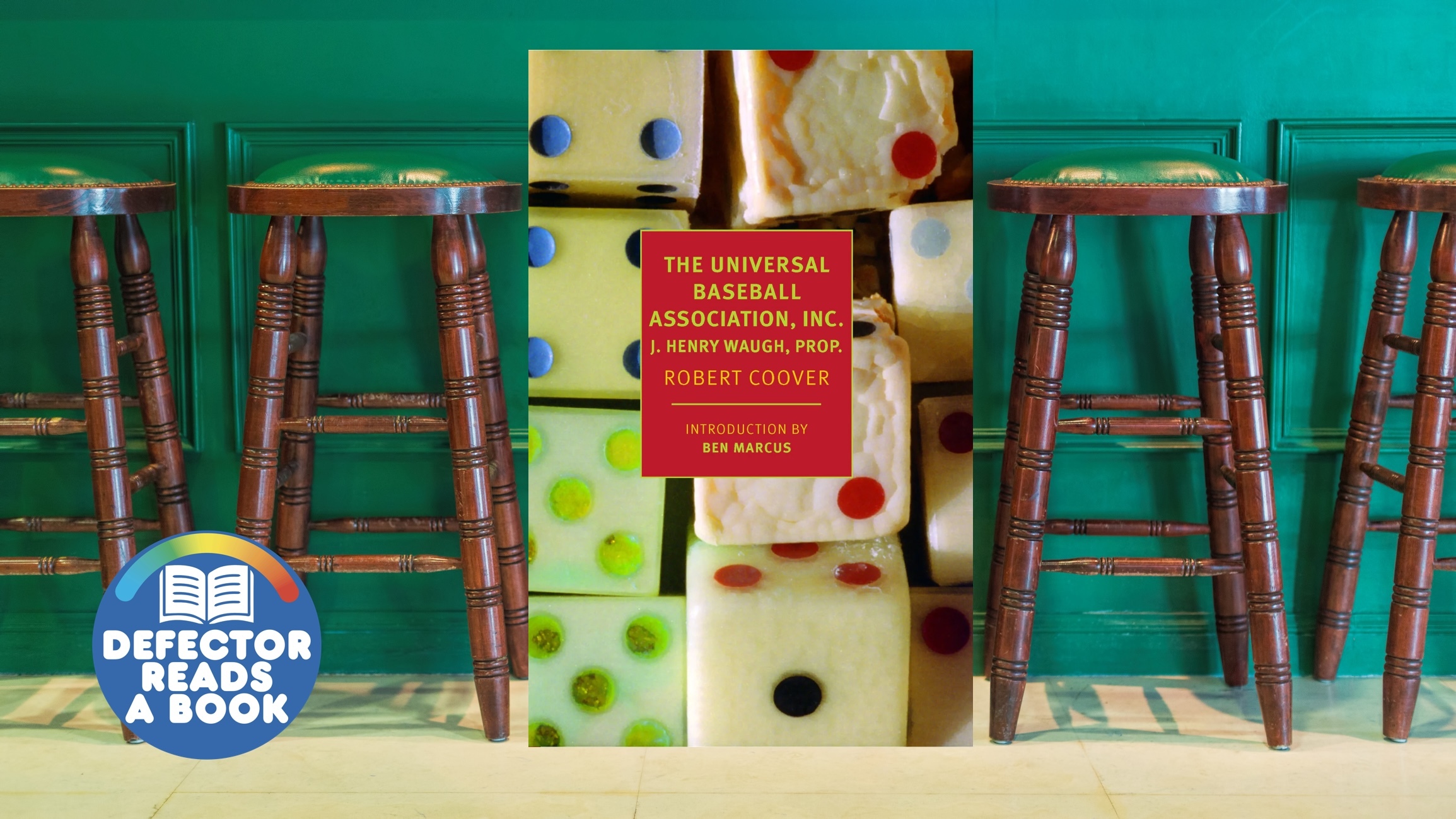
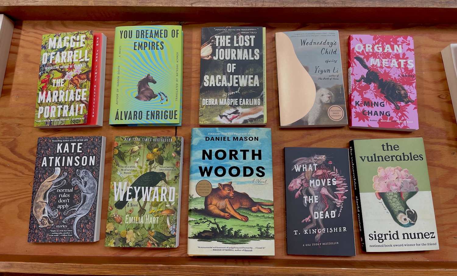
I unshelved each of the books you see atop this story from the new fiction section at my local bookstore, and I've since seen that Yoko Ogawa and Amy Tan's new books feature, respectively, a sketched outline of a hippopotamus and four crisp drawings of birds. My partner came up with this theory, and as she is smart enough not to be online and I agree with the theory and can report it out a bit, I am laundering it for her here. Ever since she pointed it out, I can't stop seeing medieval-looking dogs, anachronistic lions, and birds painted imprecisely, brushstrokes showing. You know, the sort of non-photorealistic creatures you might see in old maps of the world, the notebooks of very talented children, or archaic zoology textbooks. Torrey Peters's Detransition, Baby and Kiley Reid's Such A Fun Age are often held up as two prime examples of the blob. The cover of Peters's forthcoming Stag Dance features two oil painting-style deer, while Reid's January 2024 novel Come And Get It is adorned with a pig that appears to have been drawn with blue chalk. In the past year, the blurriness of all those blob covers has sharpened, revealing a menagerie of weird little guys.
While I am a book reader and book noticer, I am not a book cover designer. To get a sense of how cover design works and some answers on the soundness of this theory, I spoke to cover designer Elisha Zepeda (whose work I found when I was looking at my phone instead of reading). One thing I wondered was how collaborative of a process it was, and how much of the book in question its cover designer would read beforehand. "I will get the full manuscript, but a lot of times they have a very specific vision," Zepeda said. "I'll often get a synopsis and a note that's like, 'Hey, check out this scene in Chapter Two. This really describes what we're going for.' That's usually how it goes. For bigger books, some authors say they'd love you to read the whole manuscript so you get a sense of the themes and the tone."
Zepeda said blob covers are often "very boring to design," though did note how striking he found certain examples of the form, like the cover of The Vanishing Half. (I will note here that the cover's designer, Lauren Peters-Collaer, has done a ton of work I also like, including recently a square sheep, a grimacing turtle, and the parrot you see on Sigrid Nuñez's latest in this story's lead image.) Alongside the march of the mildly malformed animals, Zepeda predicted a rise in "very minimal, solid covers."
As for the old-timey aspect of the old-timey animals theory, Zepeda noted that publishers typically don't have to pay to license older illustrations. The faint emotive obscurity of an animal also neatly resolves an age-old rule of designing book covers: you cannot put a person's face on one. "There's also this weird thing with books where you can't show characters," he said. "There's the whole Woman Looking Away, right? And publishers don't want to show a particular face, because they want to appeal to the largest amount of people."
A worthwhile book cover necessarily performs a degree of distortion, since the thing about a book is that its story takes place in your brain. If you are any kind of visual thinker—though I don't think you have to be for this to be true—there's a deep satisfaction in receiving the text, filtering it through your brain, and regarding that refracted image. "Book" is an overly general term here, because the trend on the diagnostic table and the tone of imaginative glee I'm describing (or, rather, the sort I prefer) are both most fully realized in "literary fiction." I am uncomfortable with that taxonomy, which is a subject for a different story, yet it is the neatest category we can apply. The cover for something like a nonfiction book about "political practice and the information state in Early Modern Britain" offers the designer wide license, albeit one anchored in something that happened in our reality.
The case of "genre fiction" is something like the opposite. Science fiction, young adult, and romance fiction covers often defy the antispecificity maxim, showing you directly a battle between the good guys and aliens, the plucky protagonist's form, or the muscly hunk gripping the woman in the ripped dress. There's no need for the pure abstraction exemplified by the color blob or the old-timey animal, as the conventions of genre are not repressive strictures on expression but rather the raw material with which authors work. Genre is foremost a schema of referentiality, which cover design reflects.
"Literary fiction" covers, then, represent the abstractive essence of cover design in its purest and most vital form. An imagined something about an imagined something. And because there's no reality anchor, publishing houses that want to sell books to readers use covers as a way to link books to each other. The visual grammar of design is pressurized, via the gnarled financial incentives and structures of modern publishing, into something like a blunt, referential language.
There is something cynical to this, marketing conservatism triumphing over radical originality in design, though I think it'd be a mistake to follow that line of logic too far. No trend lasts all that long, and few frameworks truly preclude great work.