
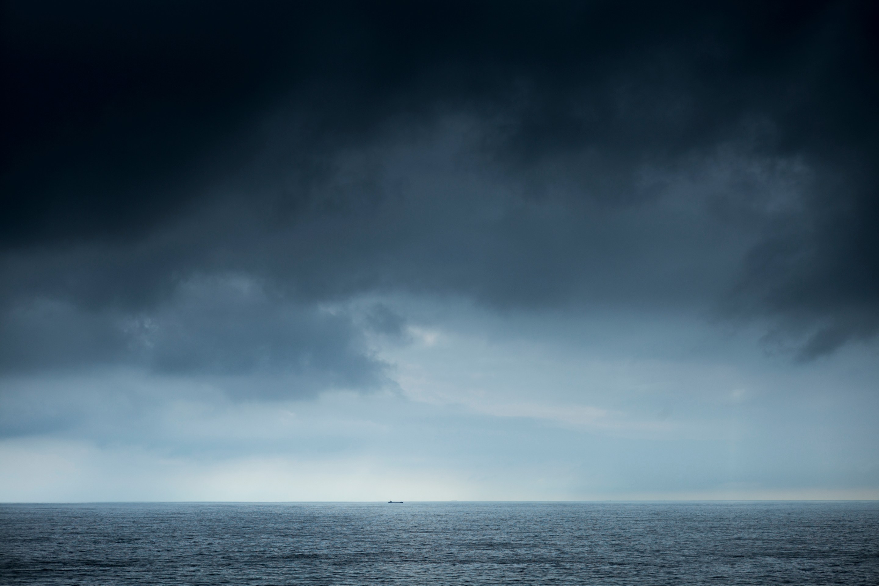
The new year is but a few days old, and I’ve already been disappointed dozens of times: once for each time my muscle memory has whipped my phone out of pocket and reached my thumb toward where Dark Sky used to be. My weather app is dead, bought and killed by Apple, and I am adrift. Do not laugh at me, and do not think I’m being overdramatic about this. It could start raining at any minute and I’d have no idea.
If you don’t know what Dark Sky was, well, maybe you’d better not read on, lest you realize what you missed out on. If you do know what Dark Sky was, you too loved it and miss it and are still scrambling to find a replacement app that can do what Dark Sky did: offer hyperlocal, hyper-short-term forecasts, in a pleasing, painless package. You’d open up the app and it would tell you that the rain was going to begin in 17 minutes. Not 16 minutes, and not 18 minutes, but 17. It told you how hard it was going to rain, and when it was going to stop. It became an integral part of my going-outside routine. You know the keys/phone/wallet patdown? To that, I added “check Dark Sky.” Now I may as well just never leave the house.
We enjoyed a decade of Dark Sky, which began life as a Kickstarter project before releasing the app in 2012. But the writing had been on the wall since 2020, when Apple, which has struggled to develop a good or popular weather app on its own, purchased it. It wasn’t until this past summer when the date of death was announced, and at exactly the stroke of New Year’s midnight on the East Coast (trust me, I checked, and then I checked a few more times, just in case), the iOS app went dark. Dark Sky’s features have supposedly been "integrated" into Apple’s native weather app, but I’ve spent the last few months’ death march trying to train myself into using Apple Weather, and I still think it sucks mondo butt. Nothing about that app is intuitive, or beautiful; everything in it is harder to find and to read.
A funny thing to note here is that the big selling point of Dark Sky was, according to actual meteorologists, not very good; the science behind its down-to-the-minute precipitation forecast was fairly unscientific. What it was doing was, in simple terms, looking at the blobs of rain on the radar map and how fast they were moving, and calculating how long it would take those blobs to move to where you were.
“It was processing the images,” Andrew Blum told Slate. “[A]ll it was doing was taking the visual input of the radar and extrapolating what was going to happen over the next couple of hours.”
Needless to say, meteorology is much more complicated than that—almost unimaginably and literally incalculably complicated, which is why intelligent, highly educated and trained professionals using top-of-the-line hardware and software still struggle to accurately predict the weather more than a few days out. For a changing, complex storm, even in its immediate path, Dark Sky’s “the blob was here so it’ll be there” engine was educated guesswork, well-marketed.
Still, Dark Sky was right more often than it was wrong, and it was right often enough to be useful. But what really set the app apart from its peers, and where no other app currently on the market can replace it, was its acknowledgement of the importance of design. It was a comfort to look at and a pleasure to use. A minimalist display and an aesthetic that I’d almost describe as organic: the graphics indicating rain were a pulsing, splashing, blob, the whole package down to the radar map presented in soothing shades of blue. And everything you needed was presented there, right there, either on the first screen or accessible within a tap. It felt like it had been made for normal people, who didn’t want to learn the ins and outs of an entire UI in order to know what coat to wear.
An example: Want to know what the dew point will be at 1:00 p.m. on Saturday? On Dark Sky, you could scroll down, tap once, and there it all was, the dew point for every hour of every one of the next 10 days. In Apple Weather it goes: scroll, tap, tap dropdown menu, tap, then tap-and-hold—and all that gets you is the dew point at one specific time. No one should have to live like this.
Ah, but there’s no use in crying over spilled millibars. So what are we Dark Sky addicts to do for our fix? I’ve tried a few alternatives and none quite hit the spot. AccuWeather is impersonal and overcomplicated. Weather Underground used to be decent until it got acquired by IBM and went downhill. WeatherBug is useful but flawed. Carrot is unbearably twee. Apple Weather is—well, it’s a lot of things, but it’ll never be Dark Sky. It seems that for the moment, all we can do is lament Silicon Valley’s habit of buying good things and making them worse, mourn for what we’ve lost, and celebrate the time we had together. Next time I’m caught in the rain, I’ll think of Dark Sky, and the dryness that might have been.