
A few years ago, when I still lived in Washington, D.C., I went with a few friends to Glenstone. The entire time I lived in D.C., my friends who liked art were gossiping about Glenstone: when it would be finished, how it would feel, whether we would ever get to go or the waitlists would be impossible to get through. The museum itself is free, but ticketed. You must reserve a spot ahead of time. We wondered when we would have to skip work, whether there would be online queues to visit the huge, semi-rural property in Maryland filled with giant Richard Serra steel sculptures and scattered with carefully designed buildings filled with giant art.
It turned out not to be such a big deal because the pandemic made people less interested in venturing out of their homes just to see a little art, which worked out well for me because I was desperate to do so. The space itself is strange and somewhat eerie. It is silent because it is in the middle of nowhere, but it is beautiful. It also feels so, so lonely.
The strangest thing about it, though, is the light. Fine art cannot be exposed to too much natural sunlight because it will fade, but art, obviously, looks best in sunlight because most things do. That means that most of the galleries at Glenstone have small sunlights at the ceiling designed in such a way that the light is always indirect on the walls. This is odd because in the hallways outside the gallery, it is very sunny, and lovely and filled with glass that allows you to commune with the outside even on a very cold day like the one when I visited. The contrast makes the galleries feel lonely.
Art, I believe, should be loved. It is one of my greatest self-sabotages that I believe in beautiful things and also believe in using them normally. Why have a gorgeous coffee table, if you can't put your mug on it? Why buy a nice pair of shoes if you have to baby them? What is the point in having a lovely painting if you cannot see it in the afternoon sun? I don't want to be rough on my things, but I also don't want to lock them away to protect them, way out in rural Maryland, in a gallery with muted light.
I think a lot about how art has been sequestered from the public for centuries, how rich people paid for art to be created, hung it in their homes, and locked everyone else out.
Today's house is one-bedroom, three-bath, and 2,000 square feet. It is located in Buffalo and listed for $760,000. If you would like to be a little concerned from the get-go, the Zestimate for this house is $227,500.
This house was sent in by a reader named Drew, who said, "This just passed through my social feed today. Built by an artist and now listed for more than three times any other home in the neighborhood. One bedroom at that. Sadly there's only a handful of pictures." He found it thanks to the Facebook algorithm, which served him details from the local news. Okay. Intriguing. Let's take a look.
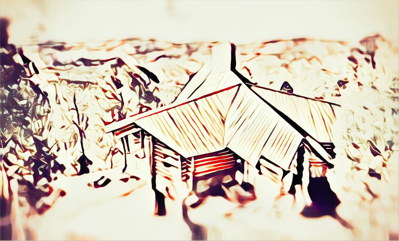
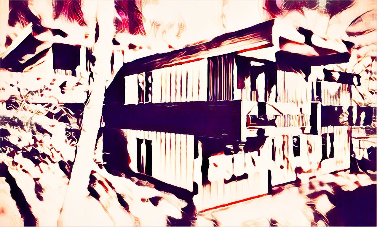
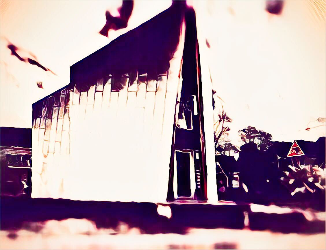
Here is the outside:
Spaceship-ass house. I have no idea how to feel about how shiny this exterior is. It feels like it would get very warm, which might be a benefit in Buffalo. This texture is actually the texture I have always dreamed that solar panels might achieve. Solar panels currently are very ugly, in my opinion. They could look like this!
This is also a very small house. I'm not sure exactly where the 2,000 square feet actually exists?
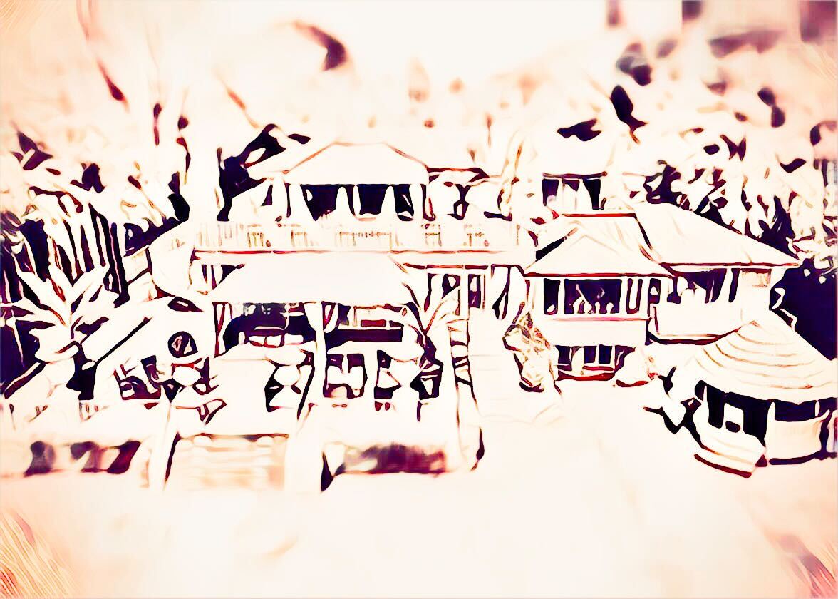
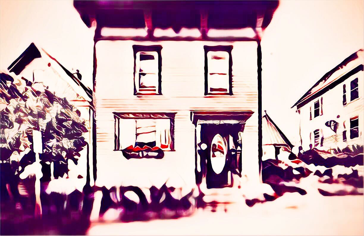
Here's another angle:
Nothing says "I'm trying to sell this house in theory but don't really care that much" like having a cone half buried in the yard and a touch of your thumb in the corner.
These windows that point inward from an angle where the sun is not, are exactly like the windows at Glenstone: made to let in light, but prohibit direct light, which is the warmest light of all. I imagine this must be especially strange when it snows, and all the light bounces around.
One problem with this house is that it only has eight photos on Zillow. Drew warned me about this before I began, but I was fascinated anyway, so we will simply look at all of them
Here's some stairs:
I do not hate this, to be honest. I have floating stairs at my house and though I do think that one day they will lead to my untimely death, they are very beautiful. What I don't really like is this suspension wire art. I like the full boundary that prevents you from falling off the side of the stairs, but it is very visually jarring for me that there is no continuous line to the floor. Imagine how much better that wire barrier would look if it extended all the way to the floor. Or if there were some kind of built-ins under the stairs. They wouldn't be floating then, but they also wouldn't look weird.
The floor seems like big slate panels, which I like, but for a new build (2019) the lack of trim and wall color feels like a real waste. Galleries love a nice dark wall and so do I.
Here's the entryway:
I am annoyed by so many things in this image it is hard to count. First off, what the hell is happening with this ceiling. Why does it look like a construction zone. The vibe of this floor and these smooth walls is "gallery" and galleries famously do not look like they have nooks and crannies for bats to live in. It doesn't even appear to be nice wood. The wood looks like regular plywood. That's boring!
This lamp appears to be from Target, which would not be bad, if this were not a pseudo-gallery space. The only kind of lighting that is appropriate in this house is track lighting on a dimmer. I'm sorry.
And all of that is a problem before I get to the way some of this art is displayed. I know that in galleries it is standard to hang paintings higher on the wall for viewing, but it looks unbelievably stupid to hang these paintings so close together vertically and so close to the top of the wall. The wall color also does not fit this art.
And whatever that metal sculpture is in the middle of the entryway is in a prime position for me to knock it over in the middle of the night.
Let's move on:
Here's a big living room. I know that all of these things are expensive, but they are arranged in a way that detracts from all of them. Why is there no big rug!? Why is everything smushed together? Why are there only three seats. This is a prime room for a nice, gorgeous couch, or a big chair. Instead we have three chairs that look like they are staged for couple's counseling.
Let's move on to the kitchen:
Wow! This is a real transition. From the bland, personality-less nature of the rest of the house, I expected this to be all black, and I'm kind of glad to find that it is slightly more interesting than that. Drew hated this kitchen. "The kitchen is a tragedy," he said. To which I say: at least tragedies are interesting.
Here is a zoomed-out view:
What is happening to the fridge? It looks like it is being attacked by coral monsters!
This big triangle table, I love. It's very fun! I like the way it fits in the room, and I like that it is this nice blue color.But I detest the chandelier above it which looks like a fire hydrant built for disco aliens.
Let's move on:
I actually love the art on this wall, but this room does not belong in a $760,000 home. This is a boring room! The woodwork is bad. The color is awful. The light is minimal.
These photos were not enough information for me, since I wanted to know more about this house.
I found a website called "Buffalo Rising" that has a column called "construction watch." This is, frankly, my dream column. I always want to know what's happening at the construction sites and what they will grow up to be. I do ask people, but sometimes they don't know! The Buffalo Rising column shows some pictures of the house when wit was just framing, but it also has this blue-print, which is helpful:
This gives a bit more context to why the table is a triangle, and where it is in relation to the rest of the house. But I have no idea where that back triangle room is, or where any of the bathrooms are! It is very scary that no bathrooms are shown! Where are the bathrooms!
In that same article, we get a little more information about the house from the man who was building it, artist Ben Perrone:
“The house is solar, all electric, and completely off grid. This is possible and should be a standard for building through maximum insulation and excellent design by the architect, Kevin Connors. Also some of the land is going to be a community garden aided by runoff roof water collected for the garden. Plantings will enhance the building and will be low maintenance.”
According to another local Buffalo news station, Perrone is 90 and is selling the house to downsize. Why build a brand-new house if you are just going to downsize? How much smaller can you downsize too! This house appears to have very little living space!
In the end, I do not think I would like to live in this house. I would rather my art fade in the beautiful sunlight than live here in this strange sharp place.
This week's house has been listed on Zillow for $760,000 for 65 days. If you buy this house, I have a lot of great artists I cannot afford to buy, and I will send you all of their names.