

I cannot even remember the amount of tasks I need to do. As I write this, I feel the kind of panic that bounces around inside your rib cage and won't settle down. Tomorrow the moving truck will arrive. I have lived in this little apartment for eight years. I was 22, three weeks out from graduating college, when I moved in here. At some point I'll write more about how it all feels and the absolute blessing of being able to spend most of my twenties in an apartment that was stable while the rest of my life wasn't. But today, I am too distracted to tell you about that so we will discuss a smaller thing: a design problem I'm having.
Because I am moving for the first time in eight years, I have been thinking a lot about interior design. The new place has many more rooms than old one bedroom apartment, so I have to redesign a lot of things. I like interior design. I read Design Sponge every day it existed. I subscribed to Domino magazine before it was relaunched. I fully believed, for years, that the true marker of success was an Apartment Therapy home tour; the true sign of fame a full Architectural Digest walk through. I follow not one, not two, but three upholsterers on Instagram. The art of making a regular house a home is one I study and appreciate, but it is becoming harder to do because all of the imagery looks the same now.
I could not find any actual evidence for this, so I must tell you an anecdote.
Because my new place has many mid-century elements added to it, I have been thinking about 1970s interior design: funky wallpapers, orb lights, fluffy couches, patterned tile. To find inspiration (ideas to steal), I have been searching on Pinterest and Google and other platforms for "1970s [room name] design." And all of the images are the same. Here is one image that I have seen maybe 500 times, its quality degraded with every post, in every location imaginable:
This is a very nice conversation pit. I like it. But it is everywhere because the way a lot of these curated Instagram feeds and Pinterest boards work is not through original research but through aggregation. Someone finds this image at some point and 5,000 other accounts repost it and suddenly it is the leading image for "1970s living room." This is the same problem fake news has: poor attribution, rapid denigration of quality, spreading like wildfire.
The stakes are less dire in interior design than in news. Instead of being convinced that the earth is flat or that Donald Trump won an election he lost, I only see design magazine renditions of the homes of rich people from the 1970s as aggregated by some Italian Instagram page. This isn't so bad, really. I am trying to be inspired. Why not be inspired by a gorgeous, magazine-ready, celebrity's house they paid someone to make beautiful for them that was then aggregated 1,000 times?
The real problem here is that this is probably not what 1970s design looked like. The furniture in these viral photos will never be available at thrift stores because it was designer to begin with. My glorified, beautiful vision of the 70s interior design is fake.
Nothing reminded me of this more than this week's property. This house is a portal into the design choices of the medium rich, which is to say people with the money to design their home but without the money to pay someone to make it look incredible. It is a lesson in the dangers of following trends over time. I have to warn you, it has so, so, so much carpet.
This week's home is brought to us by reader Alex, who emailed me the short (and terrifying) phrase, "Please help me understand," about a month ago.
The house is listed at just under $1 million in Cincinnati, Ohio. If you're thinking "wow that's a lot of money for Ohio," as I was, do not fear; you are correct. Alex said that, "we were home shopping in the area and I saw this one that was listed for MUCH more than you usually see for the neighborhood." Okay. Reassuring. The housing crisis is not yet "$1 million is normal in Ohio" level terrible. He continued, "I clicked on it, intending to daydream about living in what had to be such a fancy house. It was not such a fancy house."
The description tells us that the home was built in 1976, is still "original owner," sits on 54 acres, and is being sold "as-is." That's always a trumpet of death, the reminder that the owners will not be making an effort to try and make you like this house, you must simply pay a million dollars for a house with many visible flaws in order to fix it yourself. Let's see some 1970s design for ourselves, shall we?
Here is the outside:
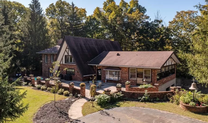
Okay. I find this cute! I like it! The central a-frame with the two wings is very charming to me. There are so many windows, which makes me think great light abounds. There is a weird hot-tub to the left on what I'm pretty sure is the front porch. That's a vibe! Sure! Let's go in.
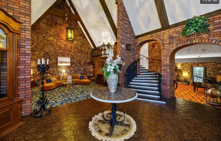
Oh. My. God.
I...I'm not even sure exactly where to start with this one. This photo is clearly taken in the giant entryway. I guess since I am very overwhelmed let's count the textures we can see from this vantage point: shiny hexagon tile, bricks on the wall, stone on the wall, smooth wooden a-frame beams, A TEXTURED CEILING, blue and cream fluffy carpet, orange and brown fluffy carpet, and wrought iron?
I am not certain, but it feels to me like eight (!) prominent and loud textures is maybe too many for one perspective. My eyes aren't even sure where to settle. Sometimes this happens when the furniture all clashes, and that is part of the problem here. Without the terrible wrought iron table and candlestick and hanging lamp, I think could be a much more palatable experience. But I think the overwhelming part is the actual structure of the house: the floors and the walls and the ceiling. And none of that is covered in paint or wallpaper.
We have to narrow what we're looking at. Let's look at this room:
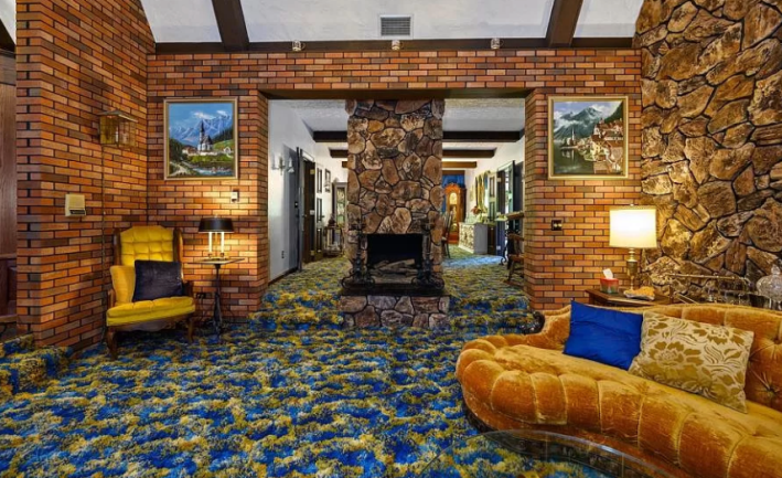
Okay. From this perspective I can see that this carpet is at least two inches deep. That is very deep. I don't like carpet because it is too easy to lose things in it and too hard to clean, but I don't think the carpet is the problem here. I think what we are actually dealing with in this scenario is a color palette issue. The carpet (because it is blue and yellow) is actually green and the rest of the room has a red-orange tint, which means it is clashing!
The longer I stare at this image the more upset I become. Why are the paintings of Swiss landscapes? Why not have groovy 70s paintings and go all-in?
Alex said, " The room with the yellow curved couch in particular reminds me of those AI-generated images where the picture ALMOST makes sense as long as you’re not looking at it too closely." He included this photo for reference.

Wow. This is exactly accurate. Alex also said he thought the carpet probably felt like those plastic leis for children. This is possible. It all feels possible in this kaleidoscope of horror.
The couch, though, is incredible. I love that it's velour. I love that it's gold. I love its shape. I would happily overpay a vintage store for this couch to have it at my house. It looks comfy.
Let's move on.
Oh god. It's the kitchen next:
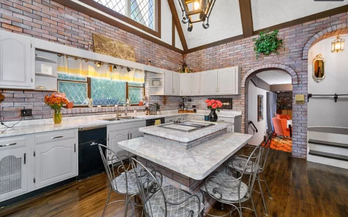
That sound you hear is the steady thump of me smashing my forehead into my desk over and over again.
This somehow both looks like a glitch in the 2009 version of the Sims video game and a kitchen set for a high school play. Why do the bricks look fake? ARE THEY FAKE? Why is the distinction between the bricks around the door frame and the flat laid bricks so extreme? I think they're fake. I think this is brick wallpaper which is even more upsetting than the other thousand textures. Everything about this kitchen makes me crave death.
The chairs around the island are too big. The tone of the floor isn't right to match the trim of the beautiful window and the vaulted ceiling. The cabinets look cheap and shiny. The marble countertops blend right in with the white cabinets. The outlet covers are black! We need another angle. Here it is:
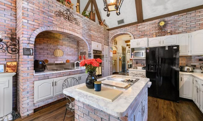
NO! NO! Is that a hot plate in the middle of the island? Why do you need that there? This angle is even more upsetting. Why would you install cabinets underneath the range like that.? Why are all the appliances black in this bland white-washed kitchen? Why are the double ovens from 1976? Do they still work? I cannot be in this room anymore. It has broken me. Let's move on.
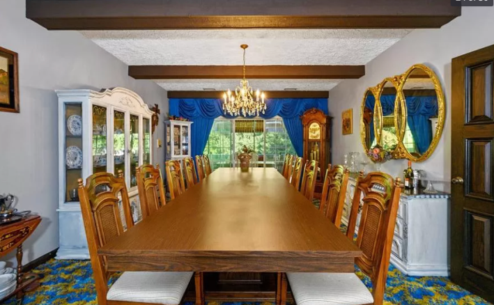
It is one thing to have carpet in the living room. I don't like it, but I will accept it. But carpet at your 12-person dining table? This is the stupidest idea I've ever seen.
Again here we have the problem of clashing design tastes. I actually do like these high back chairs, but the furniture around it all looks like it was enlarged from a doll house. The focal point of this room is not the triple circle mirror or the big table but the blue curtains. This doesn't work. Something I think many people misunderstand about maximalism as a concept is that for maximalism to work, every single element must work well together. All of these elements are fighting each other. This is a war room. I do not like it either.
Now we have this indoor/outdoor space:
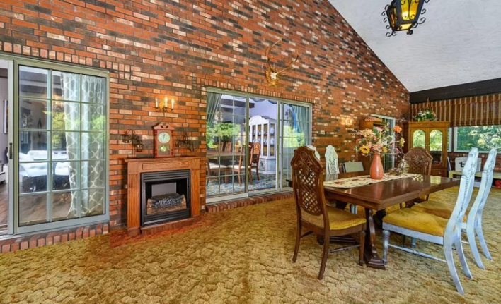
This is kind of nice! Again, we have this upsetting moss carpet, but this is a really nice room. I love the big sliding doors and I love the three walls of half-windows. I am not sure exactly why you need another six person table 20 feet away from the 12 person table. Maybe it's a big family!
I personally have a vendetta against these fake fireplaces that I know is unreasonable, so I will let that slide.
Next we have a little study.
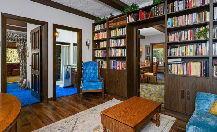
If I had enough money to create my own study, I personally would not choose built-in shelves that look like IKEA Billy-bookshelf mods. I would also not choose to put blue carpet in my bathroom, though, so what do I know really?
Next we have this living room:
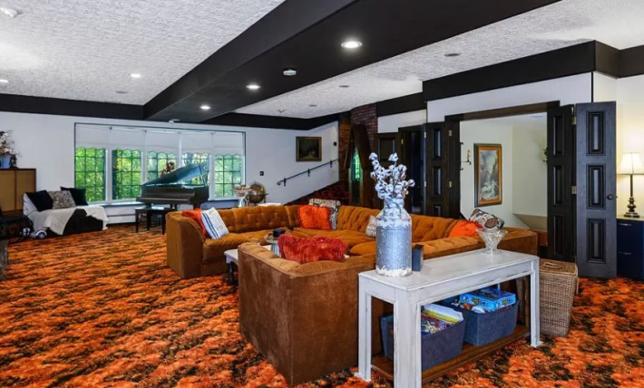
To orient you: this room is right off of the entry way and right off of the dining room. So it is in the right wing of the house. This room is huge!
I gotta admit: I like it. I am in love with this giant wrap-around couch. I will never have a home big enough for that couch but if I did, I would buy one immediately. I even like the couch with the carpet! This is a conversation pit for those who don't have a sunken floor! I love it! I think this is a fun vibe that could absolutely work if it weren't for every single other decision made in this house.
The white walls are a mistake in a room as warm as this. The walls are a cold white. They need to be cream or offer some other color. Instead the walls and full foot of ceiling trim look like they belong to a modernist museum and the floor and couch look like they belong to the house. Also, why would you paint this wood? Now instead of the focus being on the cool couch, it is on the black doors. The baby grand piano could be a gorgeous addition if it were made of wood instead of black!
Let this room be a strong reminder to all of us that though many things may come back in style, popcorn ceilings never will. Moving on!
There are five bedrooms in this house. I hated all of them, so we will only look at the one I hate most. Here it is:
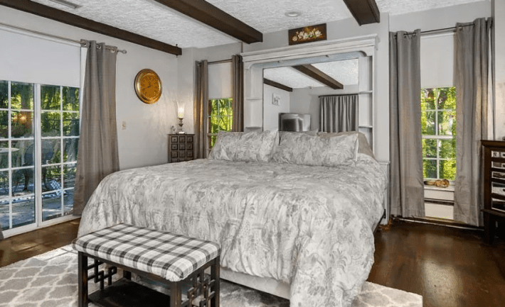
Can you hear my sighing? I am sighing.
If you've been here long enough you know what I'm going to say, don't you? Please listen to me. I am trying to help you. Gray is not a color. It is a shade. Gray is not interesting. Making everything gray is not a cohesive design choice. It is laziness. Making everything gray with one gold clock? That's straight to the design hospital for you! This is a sickness. This is a tragedy. Please, my eyes are burning.
Let's go wash them in the bathroom.
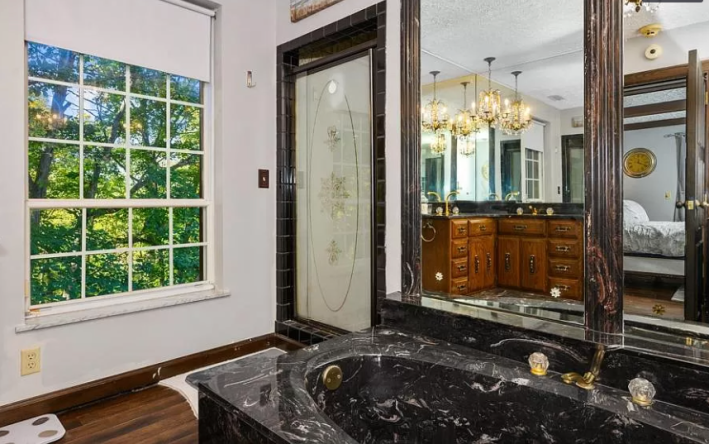
What is happening in here?
The black marble sink and tub I actually think is cool as hell and respect. Why not pretend to be a vampire while you relax? That's fun! But again we have the same clash of strength and softness that doesn't buoy either. The flowers in the frosted glass ruin the effect of the black shower. The library handles on the cabinets and drawers could be cool without the shimmery chandelier above it.
This bathroom also has too many mirrors. There should be fewer mirrors in general. A person does not need to see themselves from every angle. That is how self-hate is born.
The last part of the house we have left to see is the basement.
Alex sent me another email after his initial email with the terrible AI photo to say, "one nice thing about this house, since I said nothing complimentary." The nice thing he had to say was, "The basement carpet is ABSOLUTELY fun for the grandkids. If it was my grandparents’ house, I would beg my parents to take me there just so I can slide down the thick carpeted stairs and run my fingers along it and definitely wrestle my little brother until one of us gets hurt because we think the shaggy carpet is soft enough to absorb a powerbomb."
ALL RIGHT. Let's see it. Here it is:
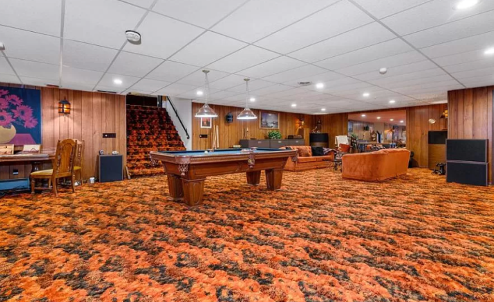
This is a big yes from me. Wood paneling! Big pool table! Comfy couches! Huge speakers! This is a hang-out room to tell your friends about. I like that the pool table is lit so you could dim those inset lights and have a nice cool basement. Here's another angle:
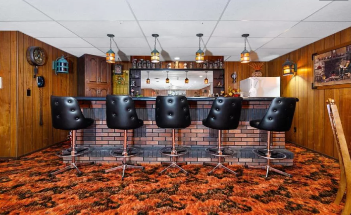
Having a basement bar is such a fun luxury. All million dollar houses should have one. The only thing this basement is missing is a big TV to watch sports on while you hang out with your cousins during the Christmas holiday. Remove that drop ceiling and this would be a gem of a basement. What a nice note to end on after such a long and ugly journey.
It is annoying to remember that the good couches I want are sitting unappreciated in houses like this all across the country, but good to remember that it doesn't mean that those houses are lovely because of it. Now I must return to packing my apartment, renewed by the reminder that I will never personally choose a popcorn ceiling.
This week’s house has been listed on Zillow for 156 days. If you buy this house, please give me a good deal on one of your orange couches. And please make sure the basement fridge is well stocked for when you invite me over.