
When I was in high school, I spent the majority of time making things with my hands instead of typing words into a computer screen. I went to an arts magnet high school, so what this actually meant was that teachers thought it was a good idea to give me (a very depressed teenager) access to things like a MIG welder and a band saw. They were right. I loved making things. I loved, in particular, welding big sheets of metal. None of you know that I am a fairly short person, but I am, and it made me feel big and strong to be outside in the sculpture yard in 100 degree heat with a flame torch bending something flat into something shapely and beautiful. It was fun.
One of the things art school teachers were always trying to explain to us is that we should have fun with our work while we could, while we were young. This did not make a lot of sense to me because I believed that once I grew up I would have plenty of time to do whatever I wanted instead of studying for the ACT (something I did not do anyway). The thing art teachers were clumsily trying to warn our hormonal brains about was capitalism. They were trying to teach us that to be an artist in the world you would either have to have another job that left you enough time for your art, or you would be at the whims of terrible rich people with awful taste. No rich person was going to let us hang 500 lightbulbs from the ceiling to make shadows we thought were interesting. They weren't going to even let us make art with too-bright colors. "But if they're hiring us," I remember asking, "why wouldn't they trust our opinions?" Naiveté is sometimes a gift.
Somehow, this problem has gotten worse since I was in high school. My friends who are interior designers are constantly miserable because no matter how rich of clientele you're working with, everyone is always bringing you photos from Instagram of the same boring, palatable designs. Nothing fun, nothing you like, just plain, easily digestible, boring homes. I notice this in my own work, uh, scrolling through Zillow listings. Everything is gray now. Gray wood floors, gray counter tops, dark gray cabinets, gold fixtures, white subway tile, gray fireplace bricks. Sometimes the gray surfaces are very expensive, so they look a little better, but it's bland. It's boring. Where is the whimsy? How many artists and artisans have had their souls crushed by people's lack of creativity and intrigue? Why doesn't anyone want their house to be weird anymore?
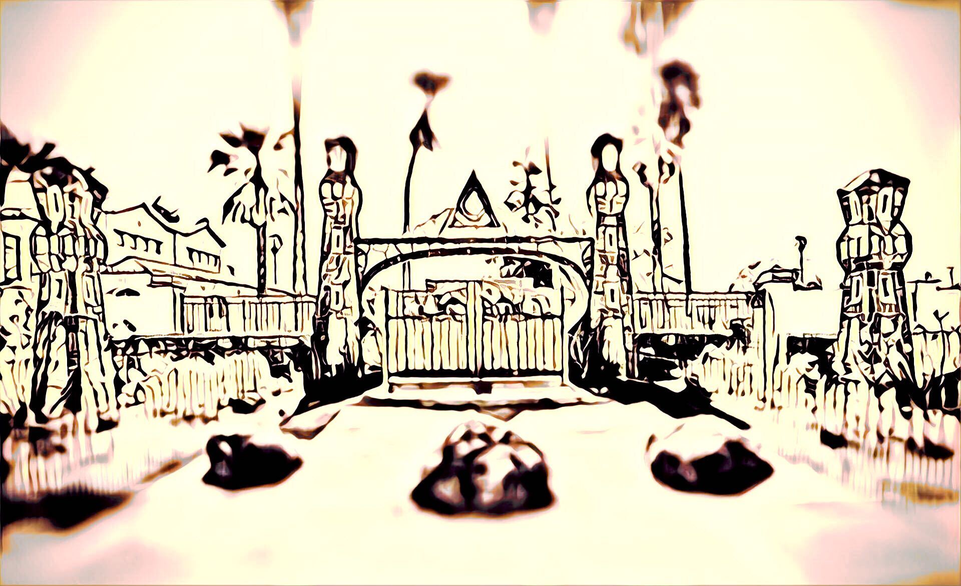
All of this is important set up for this week's house, which is both absolutely cool as hell and absolutely a piece of shit that I hate. Today's listing was brought to me by our good pal Will S., who lives in Santa Cruz. He told me he has lived in Santa Cruz for 20 years, and often walks his dog by this listing. It makes sense that Will has "a real fondness" for this property because, well, look at it!
This, I must admit, absolutely rules. Look at this brick work!!!! Look how little windows with colorful glass are built into these towers so that the lights from the house shine through this magical gate out toward the street. Look at this cool spooky triangle all shiny and white suspended above the arch. How many types of stone is this? There's brick, and inset granite, and it looks like some abalone shell! Wow this is fun. But even from this entry way, can you pick up on what's happening?
Do you see how beautiful this castle-like structure is, and all the care that was put into building it, and then how someone has just shoved the same Northern California ugly privacy fencing on either side of it? Why! If you must have privacy so badly, why wouldn't you pay someone to extend this wonderful stone work in a similar style out along the property edge. Why would you throw a distressed wooden gate into the middle of this lovely arch unless you hate beauty?
Let's go through the gate, shall we?
This feels like Disney World in that there is absolutely no continuity between these two buildings whatsoever. On our right we have some frankly incredible brick work that we will look more closely at in a second, and on our left we have ... a cookie cutter Nancy Meyers impersonation house? The fountain in the middle is pretty cool except that the concrete doesn't match the concrete (asphalt?) of this courtyard, which has a very ominous texture to it that I do not like, and it also doesn't match the fancy house. What has happened here? My first thought upon seeing this is that all of this should be grass. I know that Northern California has a water problem so perhaps it could be sustainable landscaping, but the spotty paving looks terrible with everything. "Make it make sense!" I yelled at the listing, and for you, I have made sense of it.
Turns out, I was right. The fountain is new. The I'm-a-widow-who-has-a-book-club-that-drinks-wine-and-never-touches-the-lemon-pasta-I-made-for-us house is new. The paving is new. It used to be ... grass! The original property (the gate and the one-story house) was built by a brick artisan named Kenneth Kitchen during the Second World War. Back then, Santa Cruz was calmer, and Kenneth raised goats on the property. There are many articles about this structure which detail how it looks religious because Kenneth didn't want to pay taxes, was only built at night, and was never lived in until very recently.
Will also pointed me to a very important Yelp review by a user named Greg S. who wrote, "Two of us attempted to take pictures at night, and, although there was no fog, and no wind, or dust in the air ... we could NOT get a good clear photo. Each shot had a bright haze covering the pictures and blurring out the shot." Spooky, I love it!
Kenneth's house really is quite beautiful. Look at the outside of it:
Now, this may not be your personal taste, but you have to admit it is cool as hell. Look at all these types of brick work. The floor has a nice repeating pattern. The ceiling has stucco breaks from the brick so you won't drown. The columns have abalone shell inlays shaped like turrets. There are stars inlaid at the top! All of the doorways have inlaid abalone, but broken up by mortar so that it looks like cubes instead of just a ton of little fragments. The doors are set apart by rainbows of stone and brick and capstoned with more abalone to tie it together. This is a work of art! Let's go inside!
Oh my god! The aura of this house is both terrifying and awe inspiring. Look at how carefully all of these stones have been laid. Look at the terrifying cut out above the fireplace shaped like a triangle that looks like its fixture has been robbed.
But also notice the negative space. Notice how, as we look around this first story, the upper half of the walls has been left white. The bar is designed with stone, and so is the bottom half of the wall and around the doors the stone blocks have been either scalloped or stuccoed over in a scallop pattern, I can't exactly tell. The upper half of the walls and the ceiling are white. So though this is a lot, it isn't really overwhelming. I think it's really nice, actually. I especially like that the stair railings are designed the same. So many houses have removed their stair railings for those boring metal bar ones that look like you could slip right through them if you fell at the right angle. These! These are fun
But already we are getting signs of how this will go. The collection of items in this room makes it clear that it was either being used as some kind of obnoxious "man-cave" or for the storage of interesting items that have no continuity. There is a stained glass lamp, a cool modern clock, two red armchairs with cup holders. A pinball machine, a shelf with wheels, a rug with orange balls. An art studio upstairs is full of expensive storage containers and art that I do not like. This is all for this little house, but there is another house next door.
I learned in my research that this house was sold in early 2016 to an "artist and writer" who planned to "develop a family compound." I found this blog, which details their projects on this property and how they "improved" the land by adding a new shiny house that we are about to see. In an update posted to this site, the owner calls this project a "labor of love," which is interesting since they bought the house in 2016 for $1.6 million and re-listed it for $4.6 million in May of this year, only dropping the price to $3.9 million on July 1. Some might call that a flip for profit.
Will mentioned that he was "really glad the temple wasn't just leveled for condos or a McMansion, though it's hard to see that flying in Santa Cruz's political environment." In the dozens of blog posts I read because they were available to me, I learned that the owners did a very nice job restoring the original building. They were forced to, because it is protected by some historical preservation laws but to their credit they hired a fancy mason and restored the certainly haunted obelisks and the main house. Why they did not bother to, uh, create any kind of continuity with the second building they built is beyond me.
Here is a picture of the original obelisk next to the giant new house they built on the property:
While this house is fine, and would not look out of place in any suburb, I am just stunned by the decision making process here. They have restored this lovely obelisk. They have restored the beautiful original building, and then, instead of using that same aesthetic with the mason they had already hired, they built this??? Look at these ugly stones on this wall. This looks like every single Toll Brothers subdivision in Northern Texas. These wooden barn inspired garage doors are not the same wood as the beautiful redwood fencing. Why? See how it's grayed out? See the GRAY.
Let's go inside, I guess. Oh god.
This is just. I don't want to be too mean here, because this house is fine. The floors are fairly nice, and I don't hate the wooden cross beams on the ceiling. But it is unbelievably boring. Everything is brown. There are glimmers every once in a while of something interesting: a raw-edged dining room table, a blue, three-tiled, three-sided fireplace, but there is no consistency. There is a lava lamp on the floor. The art on the walls is not parallel with the windows. The nicest thing I can say about this house is that it looks the ones that were occupied the girls I knew growing up who got brand new VW Beetles for their 16th birthdays and promised me they weren't rich.
What is most upsetting is how boring the tile work is in this house. Look at the kitchen.
The opportunity to simply mimic the big square tiles from the other house and throw them up behind the counter as backsplash was SITTING RIGHT THERE!!!!! Instead we have ... subway tiles, gray counter tops, grayed-out brown cabinets, and a stove backsplash that looks like Delia's pant patterns in the mid-aughts.
Most of the rooms in this house are so boring I don't even want to show them to you. There are a lot of barn doors and gray carpets. The windows are all curved at the top, which is aesthetically nice, but does not fit with literally any of the purchases in this house. We can look at the main bathroom, I guess, since there are a lot of photos of it and the owners seem to be proud of it.
Do you see the problem here already? Do you see those shiny tiles? Do you see this weirdly shaped window? Do you see how these big stones could BE THE BRICK DESIGN FROM THE OTHER BUILDING? Why is this happening to me? Why doesn't the tile on the floor of the shower even match the tile on the wall? This is why designers should get to decide things sometimes instead of owners. Why doesn't the shower have a door? Is it just open? I hate all of this so much and I want to leave. Let's escape out this side door.
Well well well, what do we have here? It's a big beautiful pool!!! The new owners have installed this beautiful pool for us. Could it have the same nice brick from the front patio instead of this rock that looks like it will hurt my feet? Yes. Could the surrounding concrete ledge have those nice tiles, too? Yes it could.
The moral here is that while money can rent you someone with a good design eye to help you make your house not ugly, it cannot convince you that you need one. Or maybe the moral here is that even with historical preservation laws, rich people can still dwarf beautiful old things with their giant stupid homes.
This week’s house has been listed on Zillow for $3,995,000 for 55 days. If you buy this house, please tear down the ugly one. There is no hope for it.
Correction (2:45 p.m. EST): Santa Cruz is in Northern California, not Southern.